I was thinking of why these two paintings kept failing years ago.
The main reason was that as stairwells they offer all sorts of options to exit the painting but the middle space goes nowhere.
I thought that by lining them up next to each other I could create a sort of diptych but again the fact that they both have a wall sitting there in the middle made it nearly impossible to dive into the work with any decisive lines.
Thus no story could be told and the only impression that could be given was that of painterly effects, colors and contrasting edge juxtaposition between two dimensional and three dimensional forms.
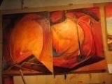
As one can see from the source image of the painting on the right, I had forgotten about every single option and wasn’t even really finding useful reference material back in 2004 to remember what I had first started in 1989 with an opaque projector.
Victor Horta:
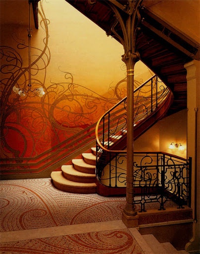
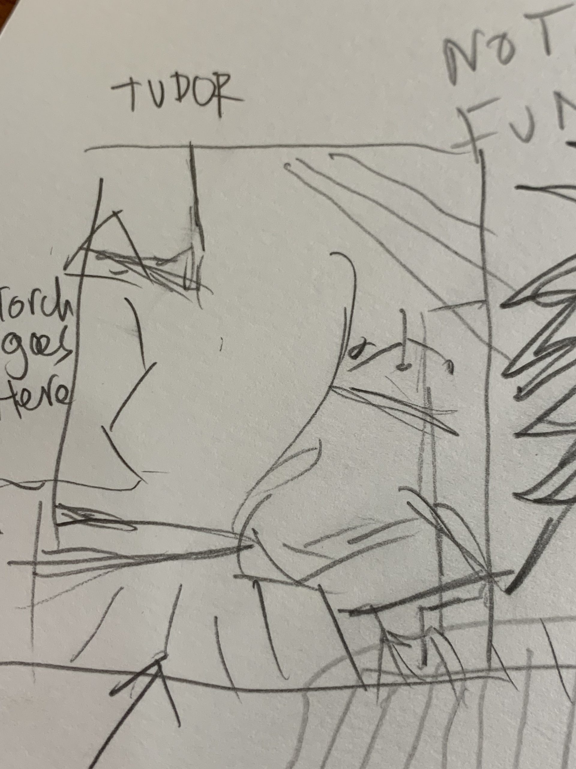
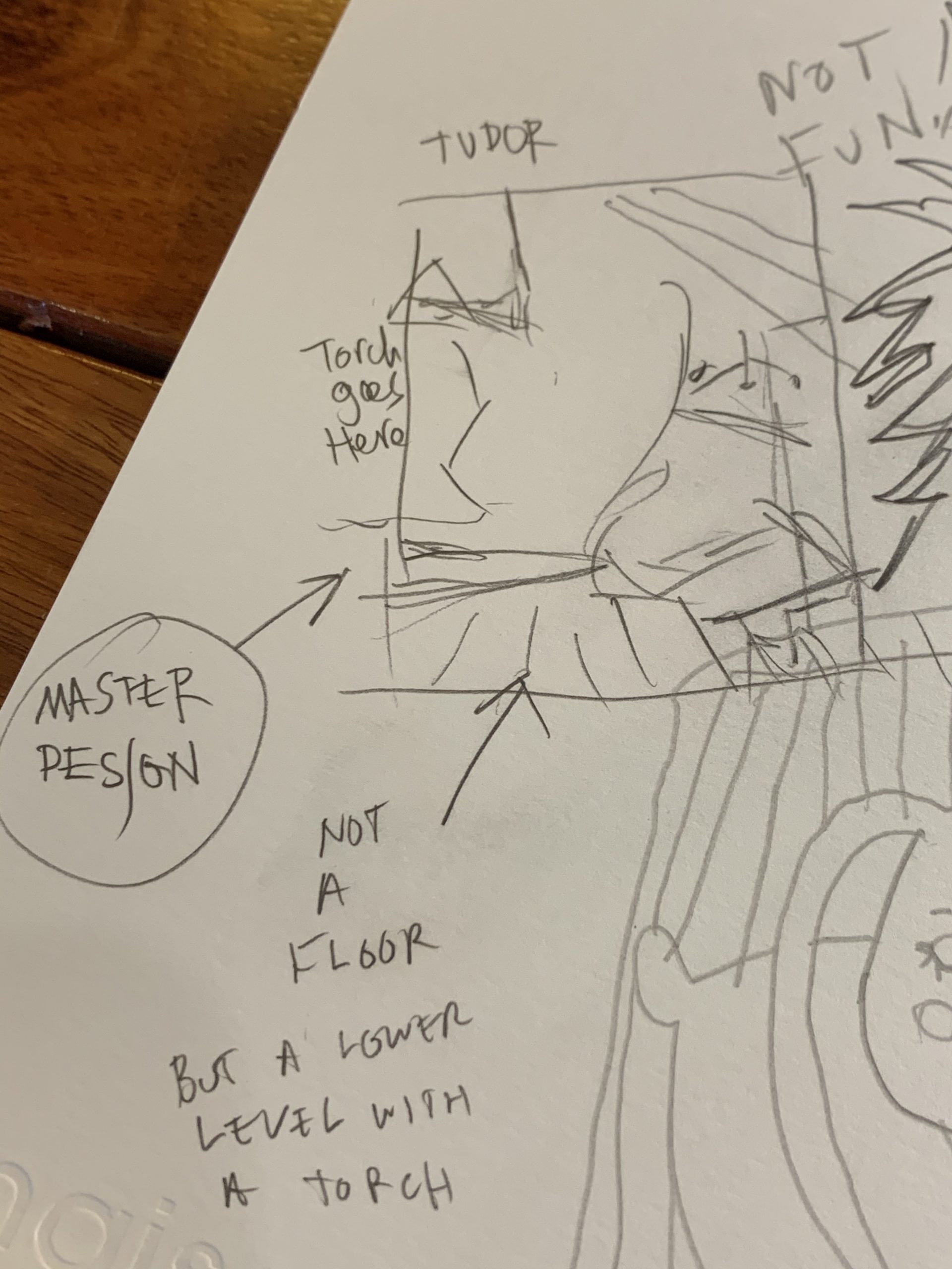
After thinking on this for a while more I realized that the middle of the painting and really the middle of the photo was a wall with extremely fancy accessorization and decor.
I calculated that if I were to remove the wall and replace it with some other form that had depth of perspective, spatial depth, I might be able to get more into the painting, which was a lesson that I learned from deducing some of the success of Southloop.
To give the eye plenty of places to roam around one has to push the space as far back as possible, and Southloop covered miles compressed into a 2 meter x 2 meter square, and offered random details in 3D with just the right balance with the graffiti meets cubism 2D vs 3D interplay recipe I’d devised.
Graffiti had more modern and appealing line shapes and a dynamism and emotion where ass cubism was still good at the construction of space and juxtaposition of 2D and 3D linework, all with abstraction in play.
I never really got past the stumbling block but now I may have done so.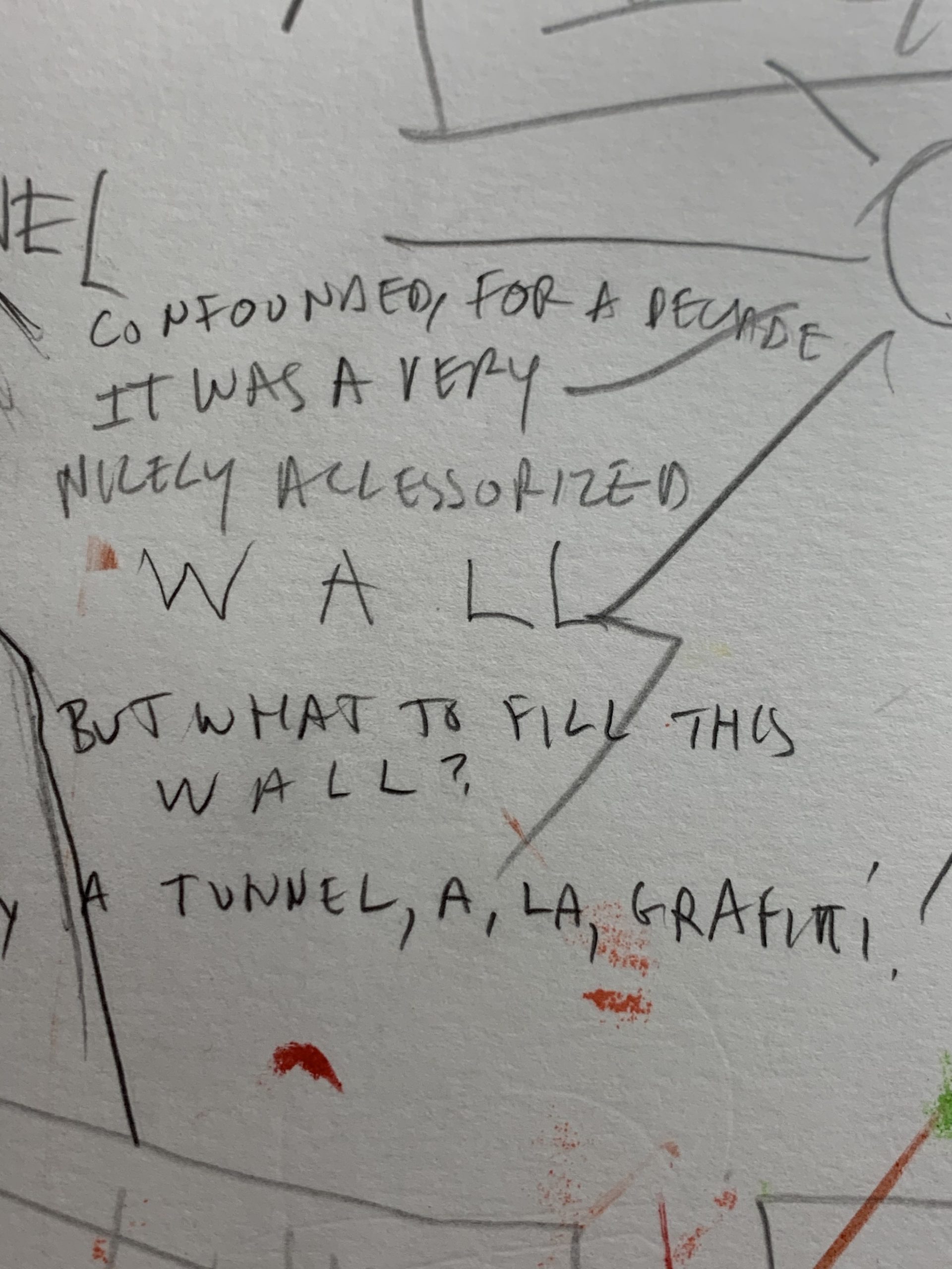
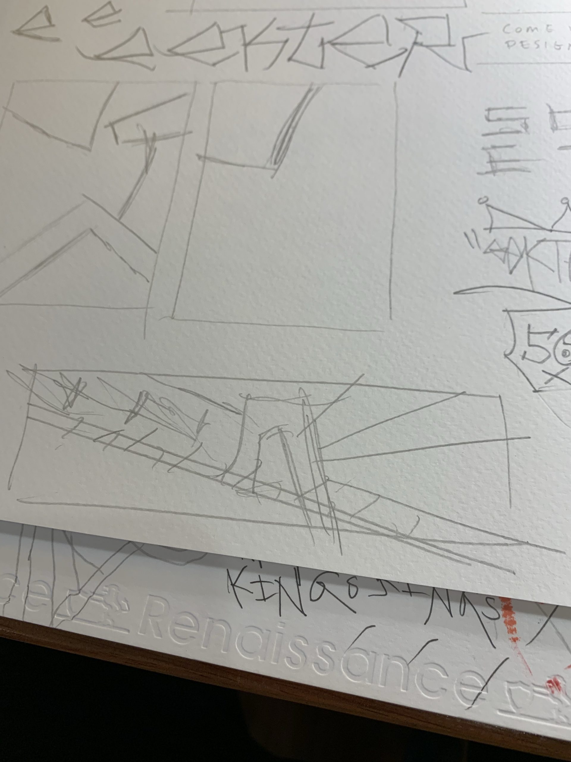
So my theory is now that if I process a piece that has more depth of perspective I have a better chance at working out something of interest.
More research and design and drawing is required to really figure this out but I will try to use as close to the original formula as I possibly can such that when it gets around to the paint it is a very certain situation with little need for major corrections. A possible winner even.
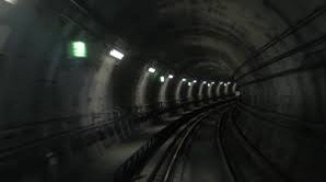
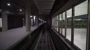
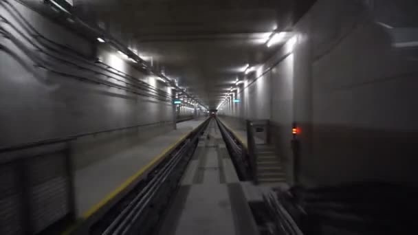
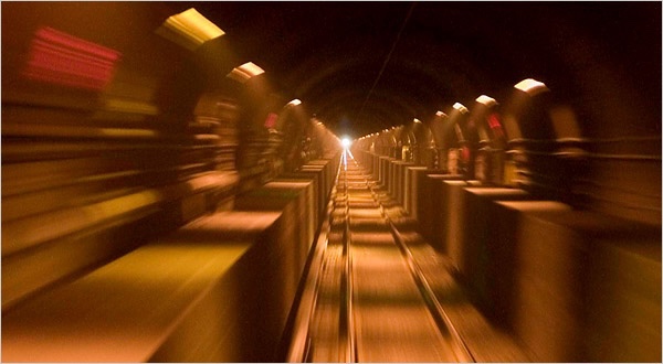
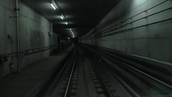
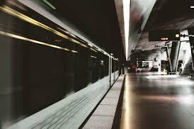
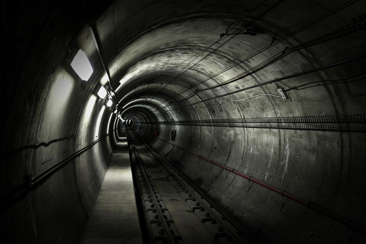
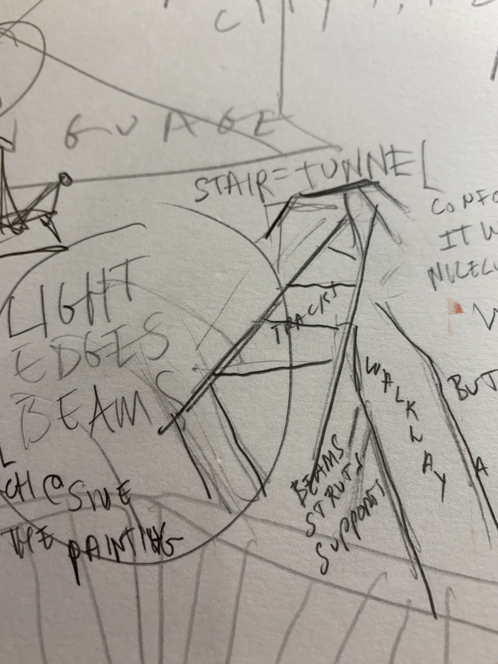
I still have the intention to keep this all about cubism meets graffiti and getting back to the theme of the city and especially a subway tunnel or a rooftop or a train station is going to build out this series in a few nice directions with regard to palette especially if I am able to work in some of the influence of Paschke lines and Paschke colors.
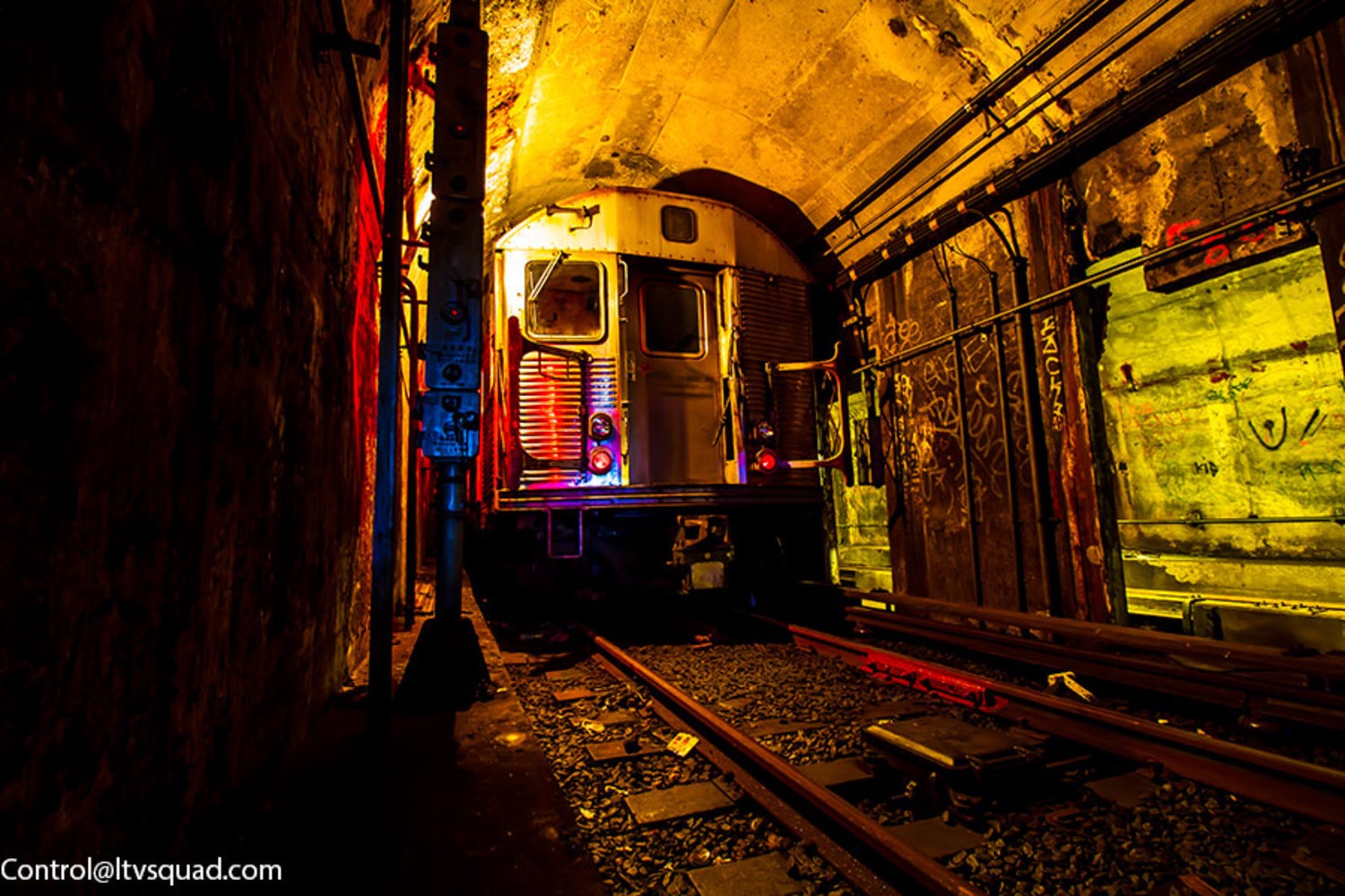
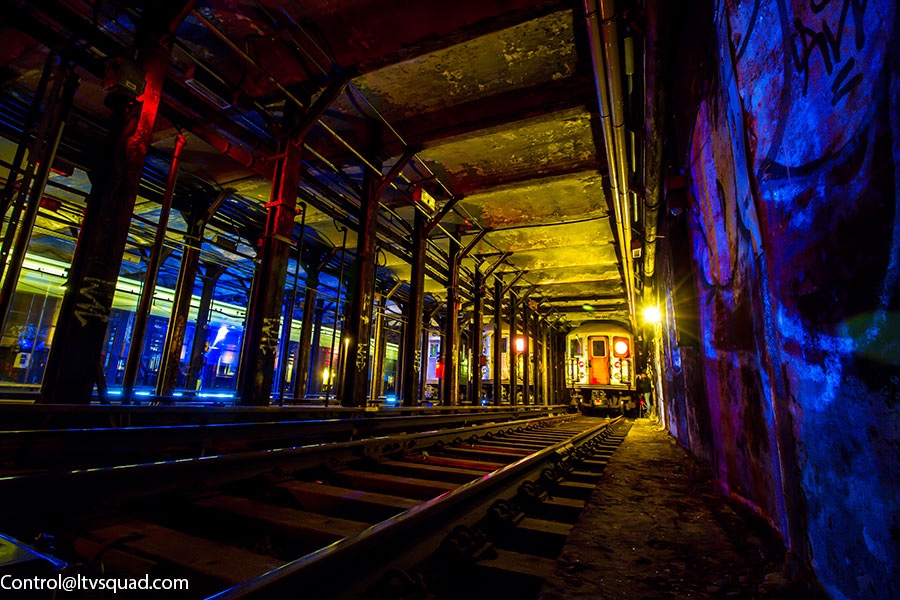
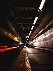
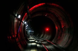
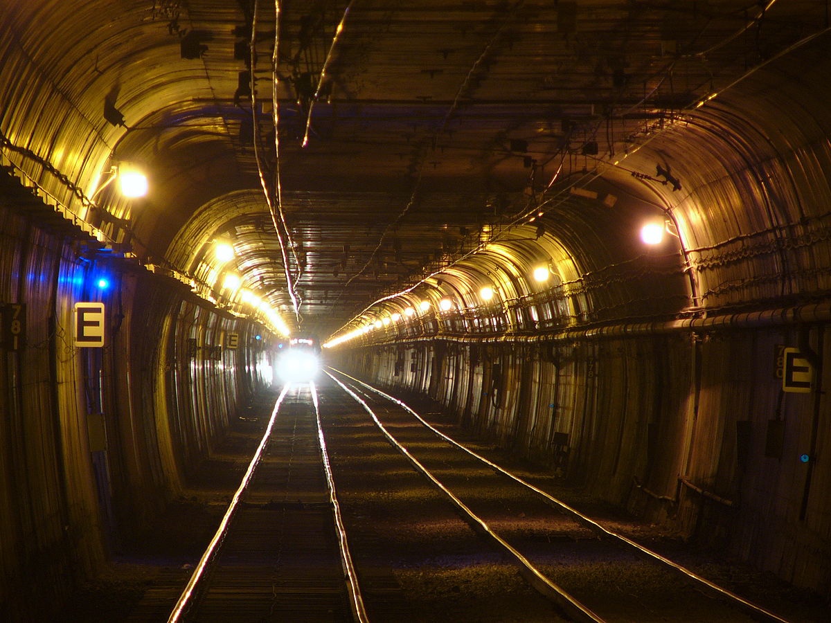
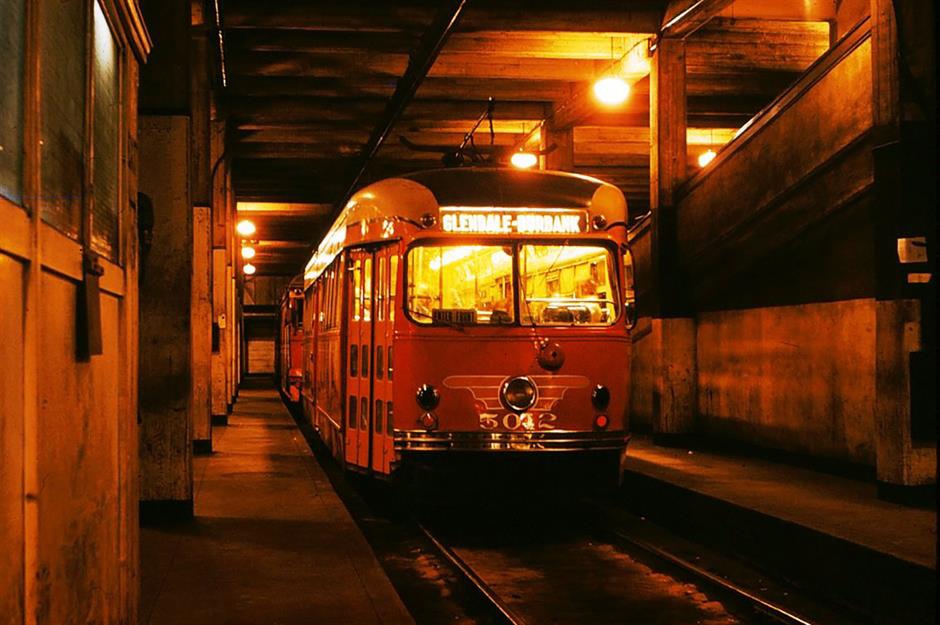
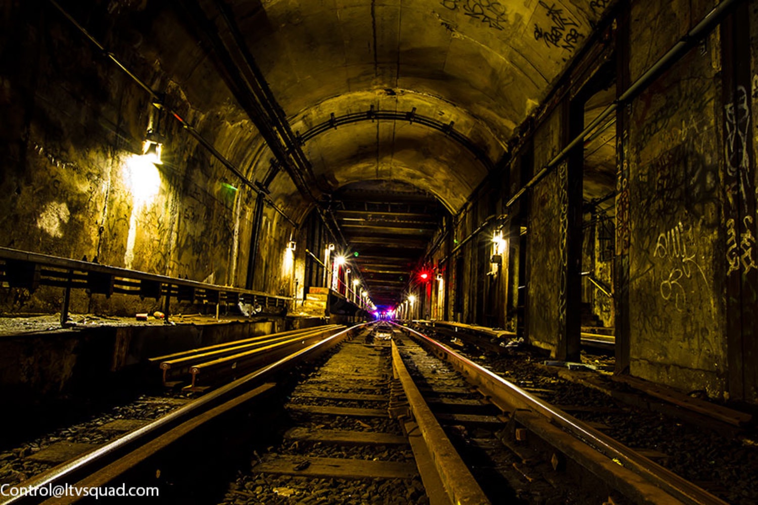
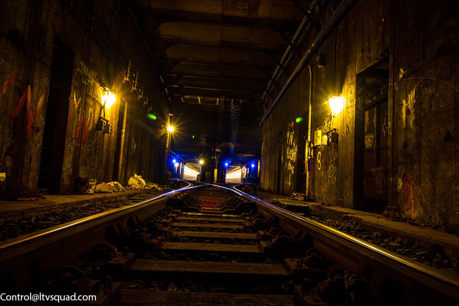
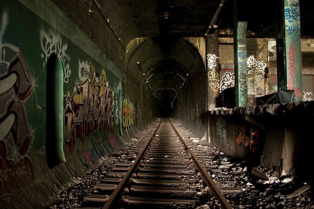
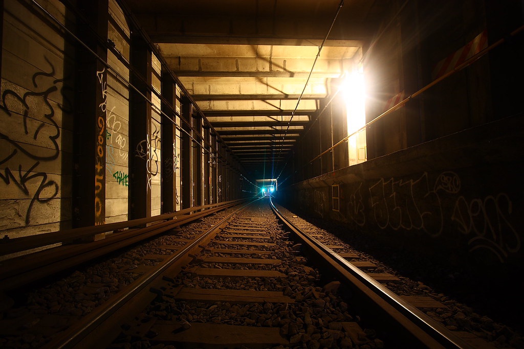
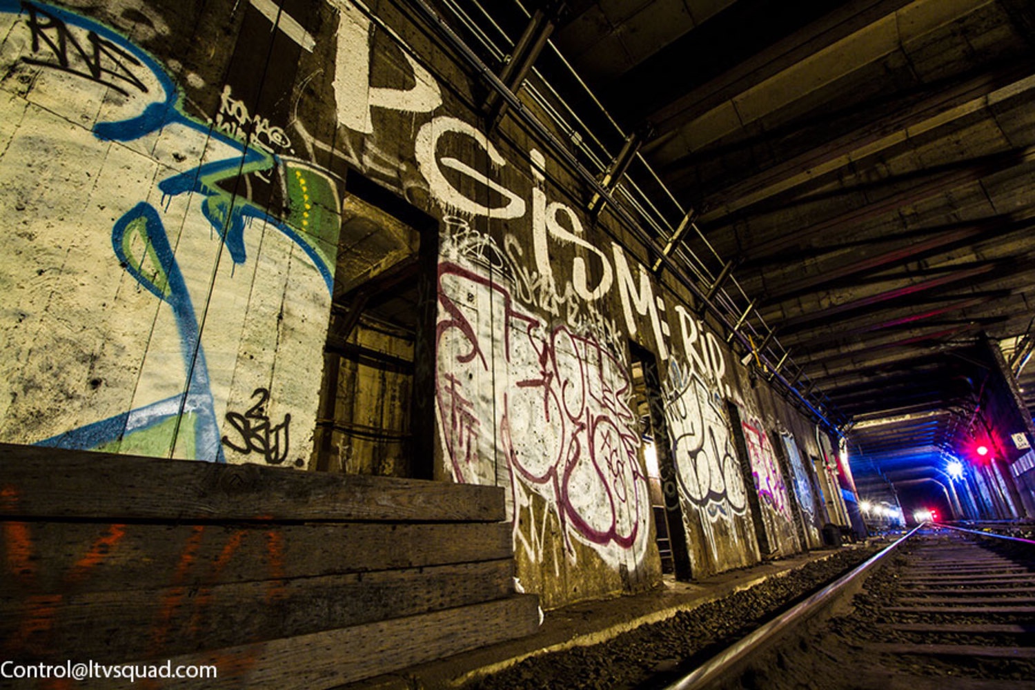
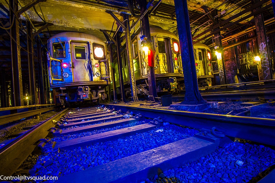
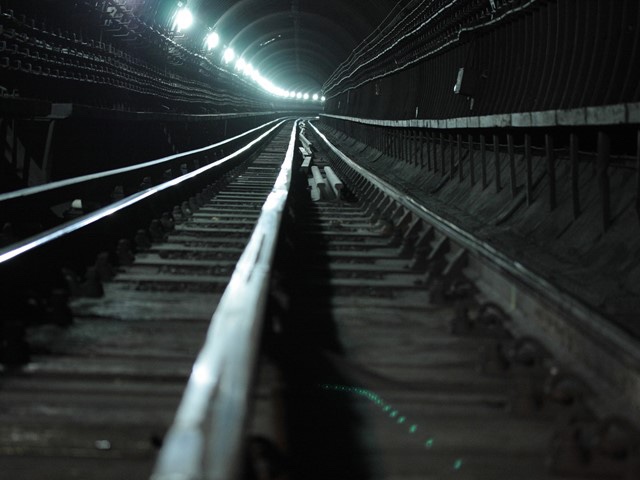
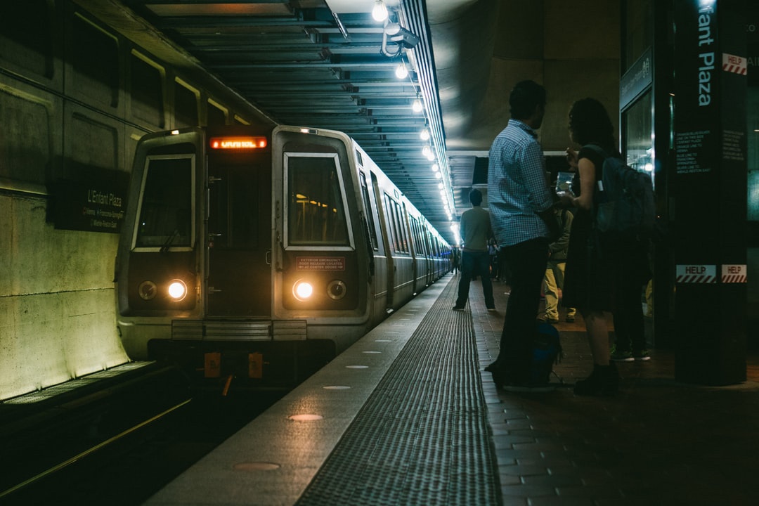
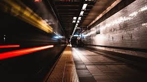
Here are some of the subway images I came across that might be of use: