Ok need to just get a view of what’s in.
>-Quaere Cosmos Arcana Imperii-<

Ok need to just get a view of what’s in.
That’s right, the species known as drawing table now gets a dedicated post.
In my opinion, you can’t run a studio without a LOT drawing tables or easels. Make an army of them. Make drawing tables that can hold a serious work, and then make another. You can try to get by with less but over the years to make progress, you need to be able to give a certain painting or drawing it’s own dedicated space and time.
So yeah, I am going to hunt down and build whatever I need. If I have to MACGYVER that shit so be it.
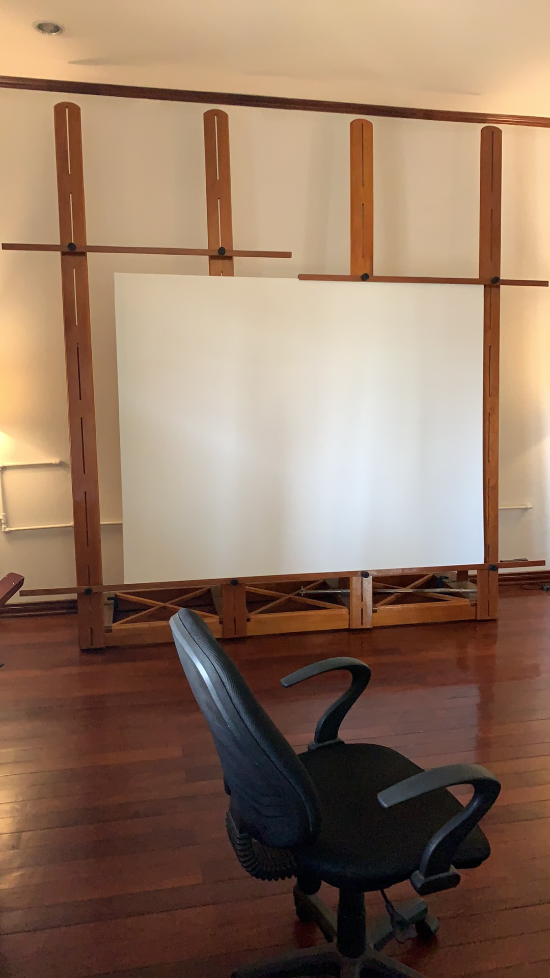
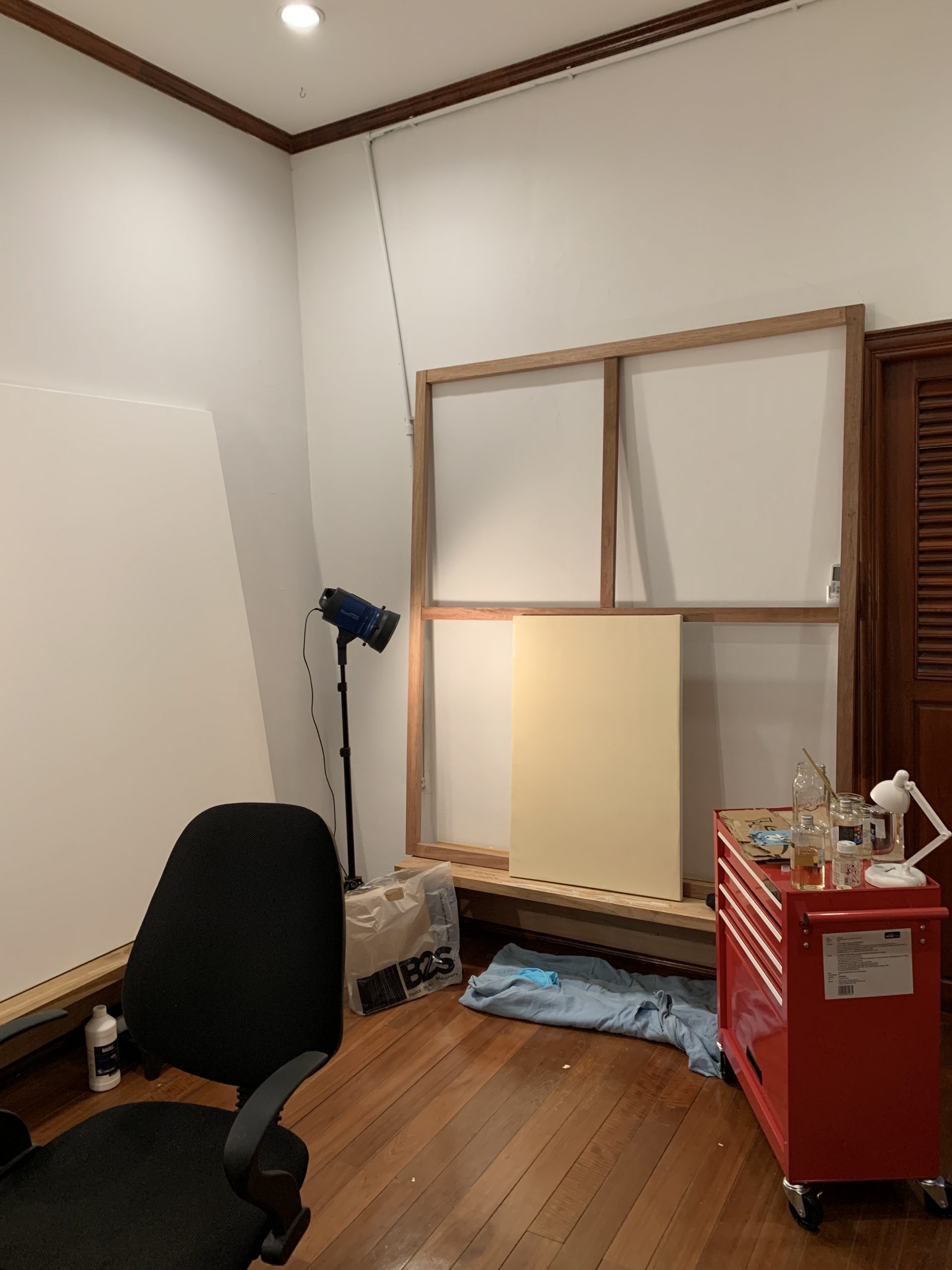
So the first project I have built part way is a Wall Easel Footing.
You might ask what the fuck is that. It’s one of these. I’ll load up some additional pics showing it up close with a painting on it. In some pics you can see them but distant. I’ve already moved them from one wall to two. Looking forward to adding on the next feature to them. They are fuckin’ heavy. Sturdy as hell.


I can then stand and just as comfortably render the top of the painting. And that’s just for that one piece or anything up to 9 feet wide.
If it needs to be higher well then guess what pal, -it’s gonna be on the wall right next to this one. That’s for the works that are about 6 feet to 4 feet wide or whatever height tall. The “bottom” will be about chair seat high or maybe a bit higher.
Will these be somehow super adjustable? Not too sure about that. Why? The adjustable aspect of easels is the DEATH of your wallet and for the small army of tools I need I want hard core durability.
I want a battle tank of an easel. Something that would destroy a stone castle fortress on a seaside cliff if it were catapulted from a battleship. I want an easel that will withstand an asteroid impact.
Why? I’m tired of squirrely studio stuff. It’s like some in-built genetic mistake in artists, they always have flimsy shit holding up their work.
Perhaps it not even durability for extreme customization. Perfectionism starting in the base of the setup. Perfection in this case is something IMMOVABLE under heavy use. And ability to be put into action for anything 24″ height to 7 ft height, any width. Mission accomplished.
I am having a TON of fun INVENTING. Almost more fun that the paintings might be but we’ll see.
This is the first oil painting that I’ll be doing of production quality, an oil paint version of a drawing from 1989.

Paintings require a lot of tools, lighting and other things like “ease of rendering position” -and there are $5,000 easels that do it in style. You have to get on the waiting list and the guy who makes them is really cool.
Very nice but I realized the room it’s in is like our central upstairs hallway / room. I just can’t unleash oil paints, solvents and such in there.
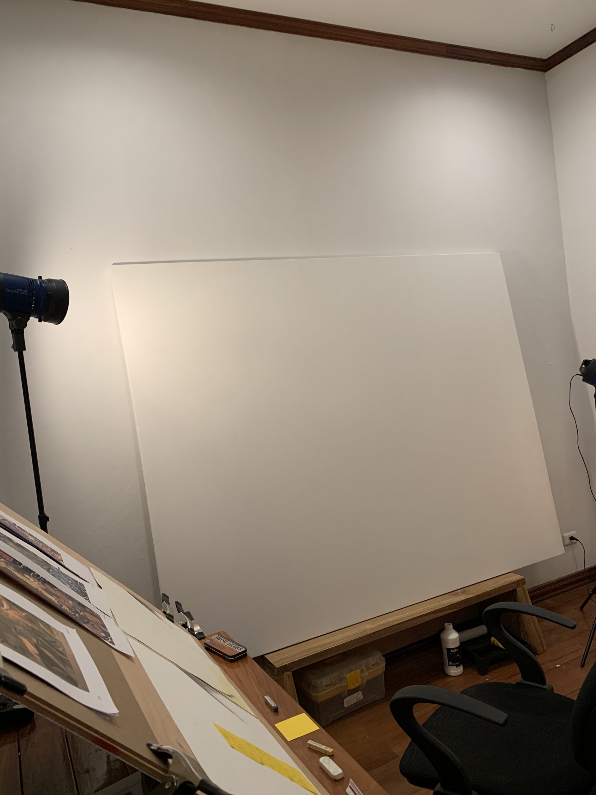
I solved that quandary by changing up some other rooms. Turns out the smallest room is a great place to concentrate. and it has a 9 foot wall which holds one of the biggest works I am onto at the moment.
This shows the 7ft long work on the new easel base. I have yet to add in additional framework, and might not. This is pretty suitable so far.
The easel bases or “footings” are strong enough I took one of the pair and moved to easel wall “B”.
Here’s a gallery below, of not only standalone Easels, but EASELS IN ACTION via Conservation or Restoration. These experts are so good at oil painting they are trusted by museums to maintain, repair & restore works from antiquity. A bit different than the standard youtube back yard shed folks.
There’s a lot I learned by way of observation, seeing conservation experts at work on various easel and work area setups. And how variable scale, quality and actual texture of the various works as seen from up close or distant perspective, via high quality photography. I myself worked in film and video related jobs as a contracted artist so I am familiar with doing large scale works over 100 ft tall and 600 ft wide. In the movies they are referred to as backdrops, and you need to use scissor lifts and condors (like a small 4 wheel mini crane).
The stuff referenced below is smaller scale than all that.


OK, it’s been some weeks maybe even months after getting stretcher frames made by a finish carpenter, and getting the entire top floor re-arranged to truly accommodate my efforts across 3 different rooms.
One of the biggest challenges has been sourcing supplies, especially across multiple mediums and on a budget. Most of the results from Google show a lightweight version of art supply in Thailand and very out-dated. And it’s people taking their kids to buy art pens or something. The rest are broken links. These links will break one day too, perhaps 10 years from now. But today they’re good.
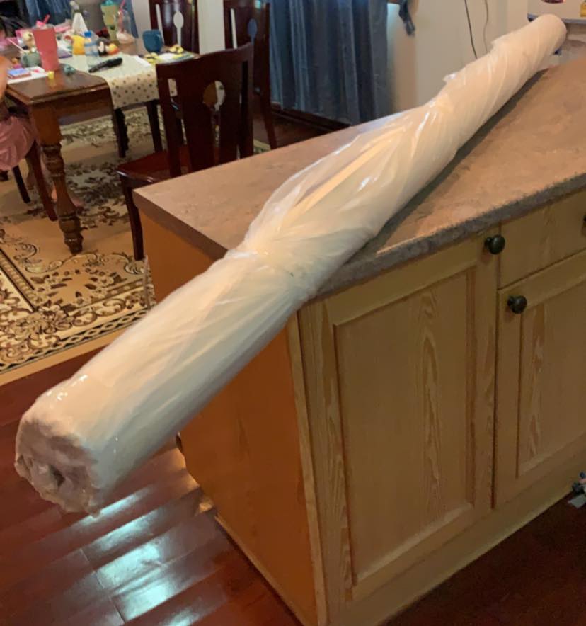
My main medium is oil, but I had been thinking more along the lines of Acrylic on panels after oil on canvas seemed a pipe dream, especially canvas. Couldn’t figure out where to get it on a roll or by the meter.
No, you just need to be extra savvy with your Thai resources.
Here are the main suppliers I have found and will be using:
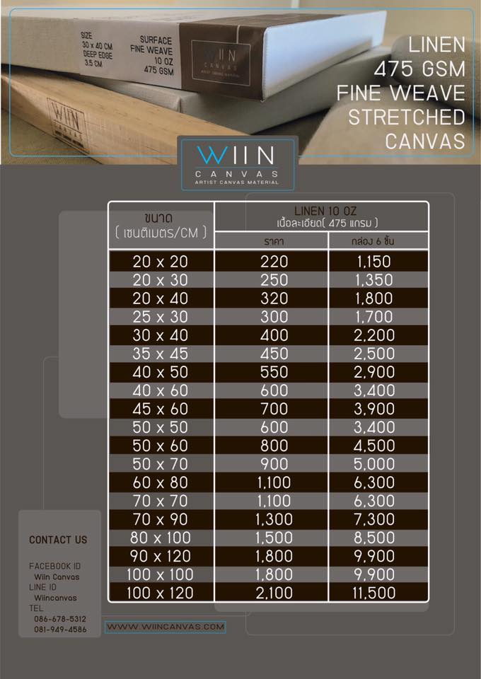
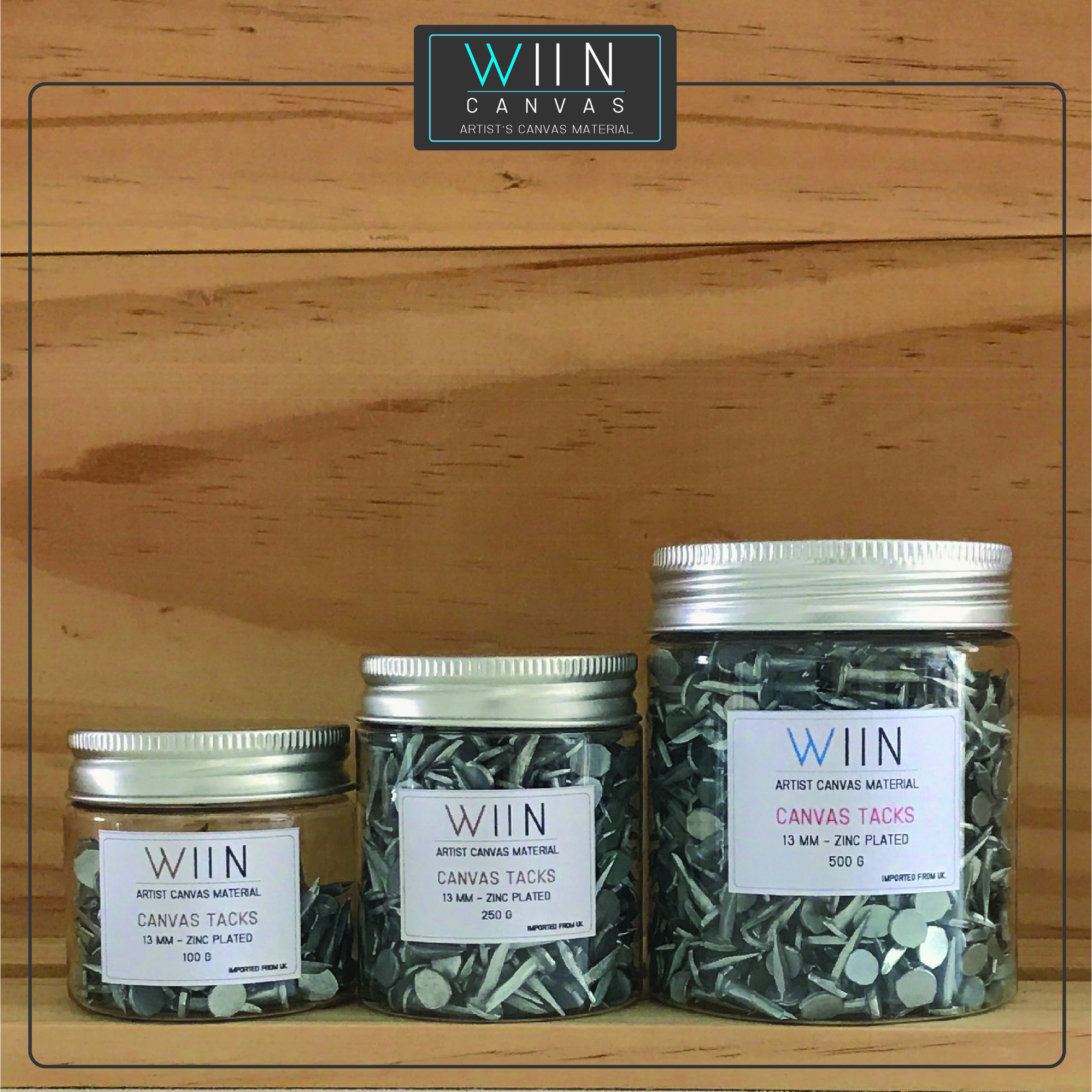
WIIN CANVAS – https://www.wiincanvas.com/
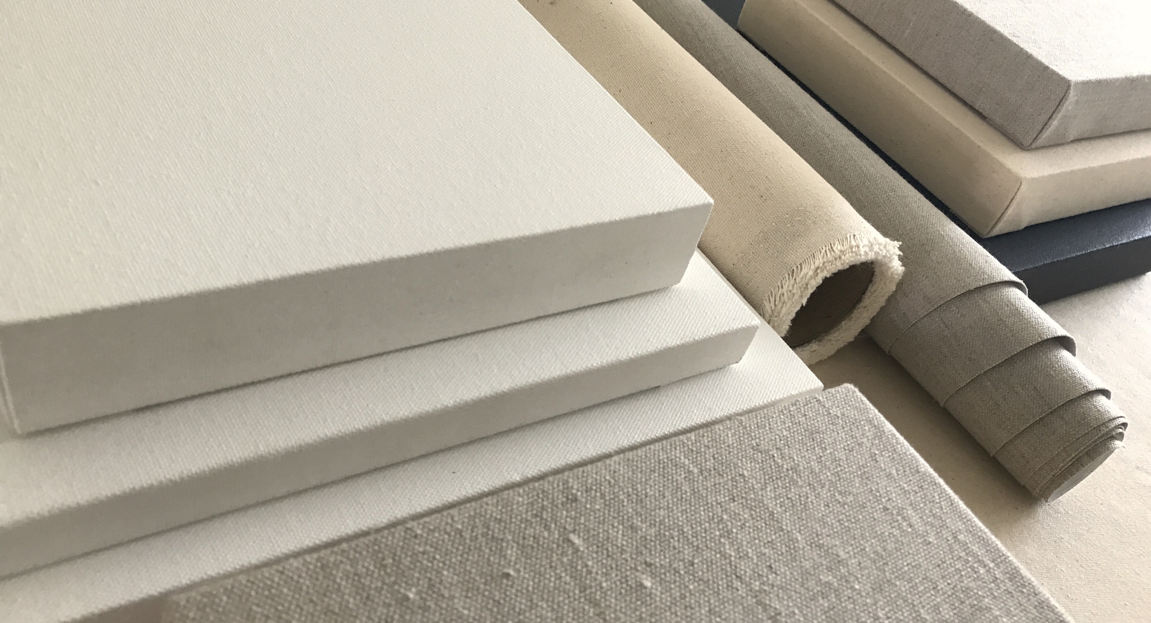
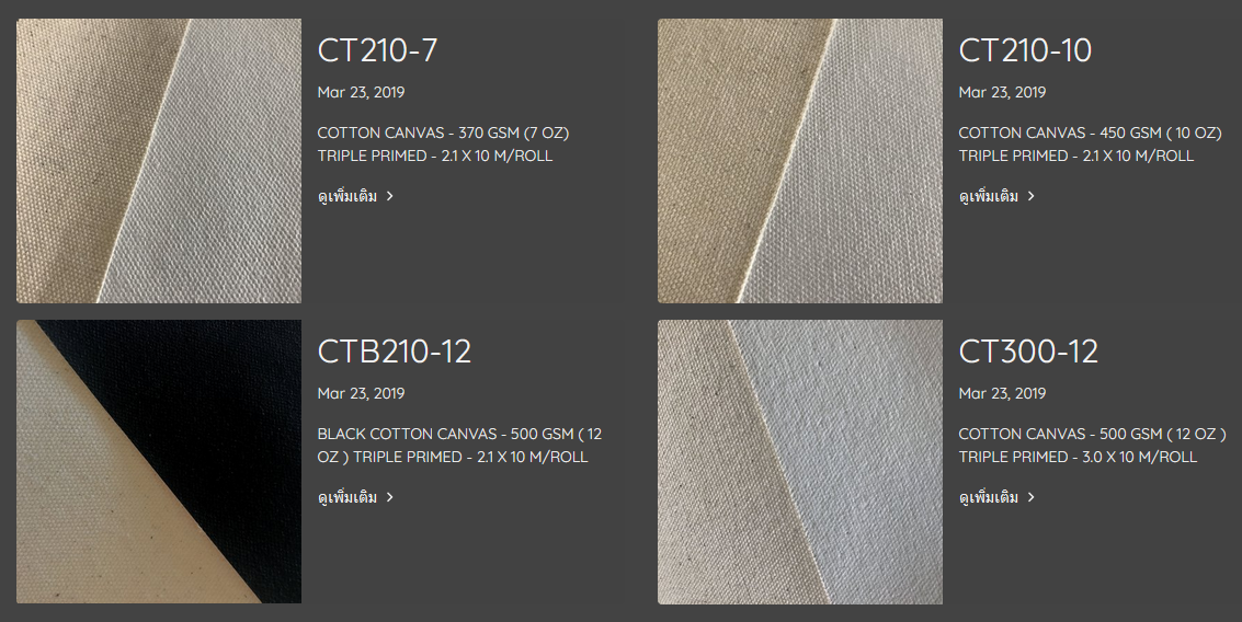
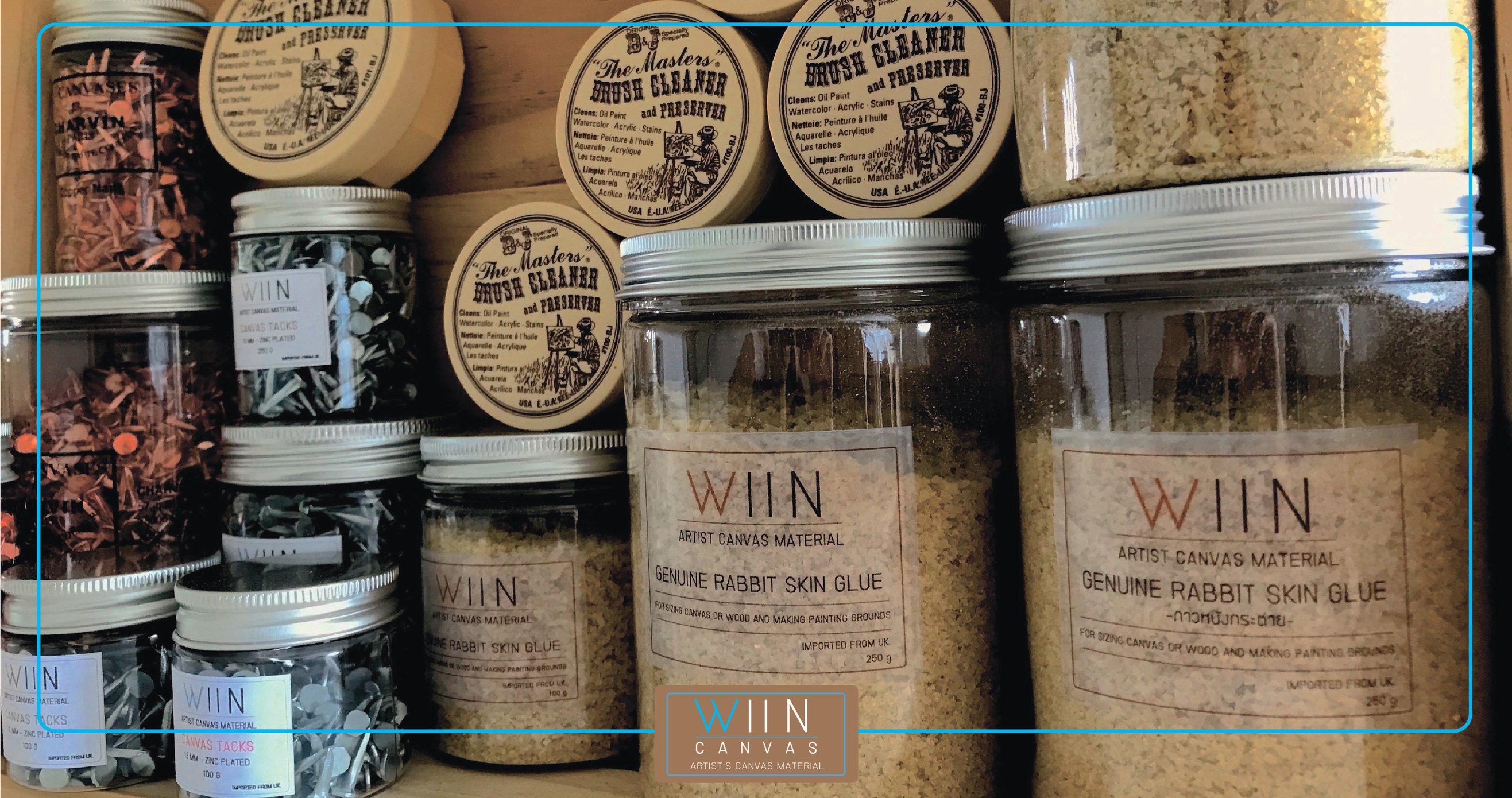
WIIN Canvas is proven via recommendation from my wife’s friends who paint, and an order I received. They have an impressive line of canvas that blows away anything I had previously found even in the USA. One of the few surprises in a land that I had previously thought bereft of quality studio supplies.
Theykeep it simple. They just sell canvas, and enough kinds to more than cover anything I’d be doing no matter how high quality I need to go. To start I went in cheap to test. I got a 2 meter roll @ 10 meters long Cotton Duck #12 Gesso primed shipped to my house overnight for $90. It’s a nice one, and first I have ever bought of primed after decades of doing all that myself building stretchers, fitting canvas, priming in gesso, then oil.
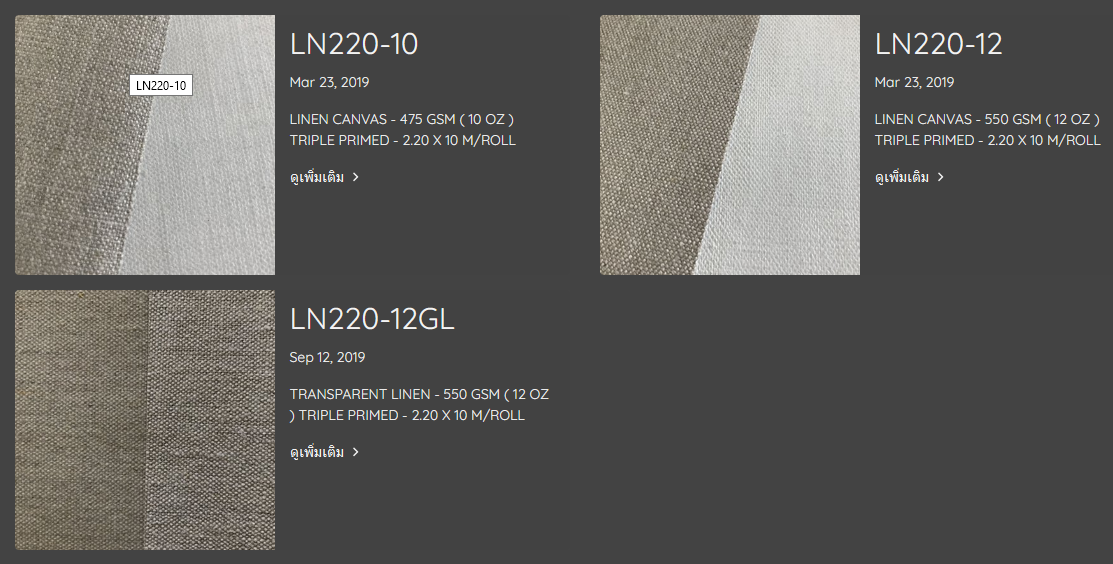
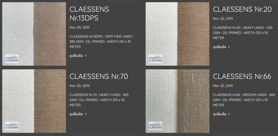
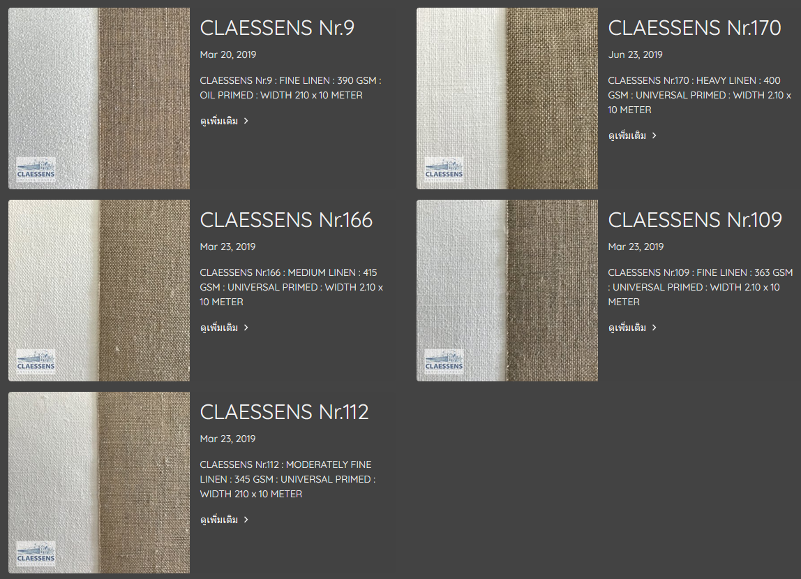
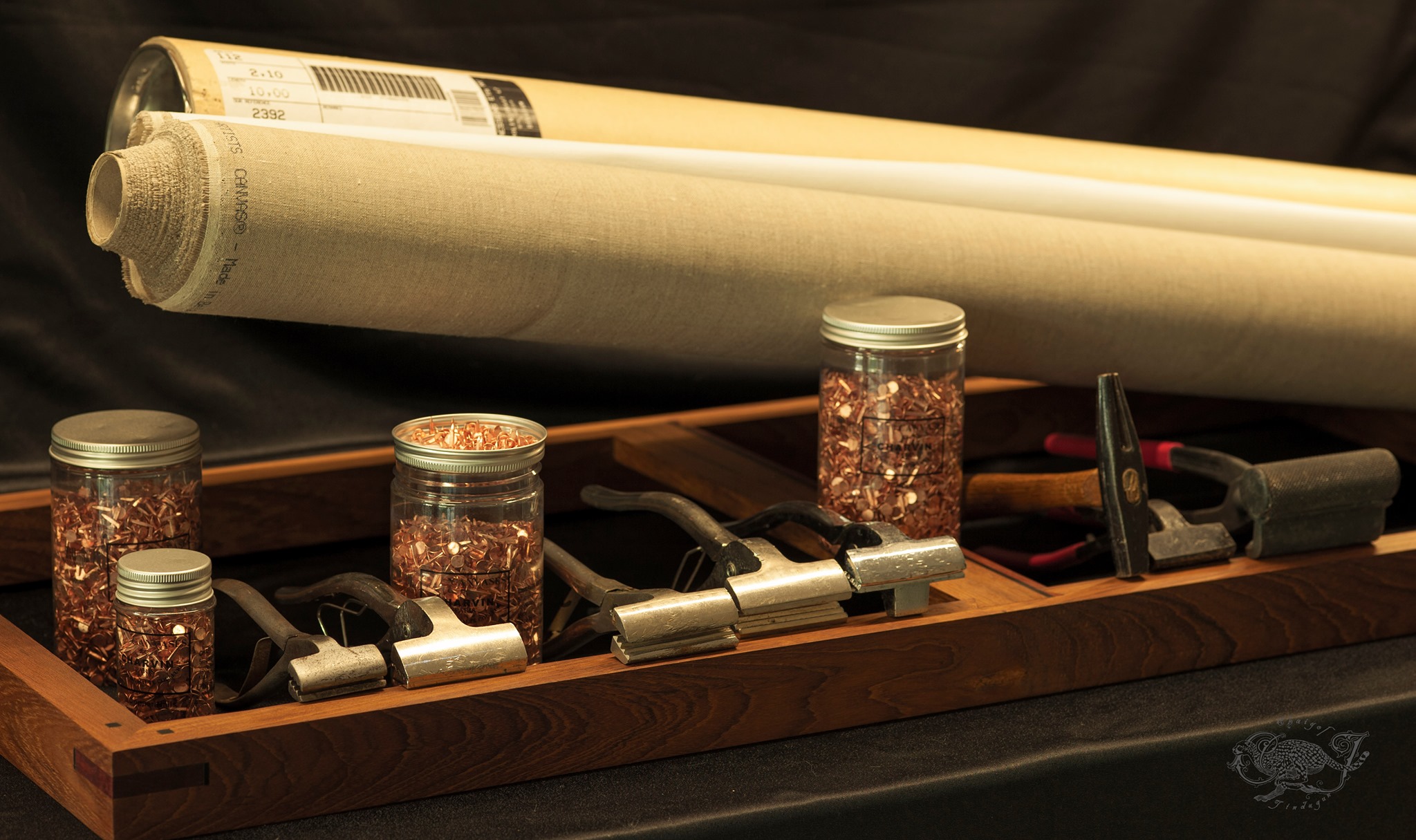
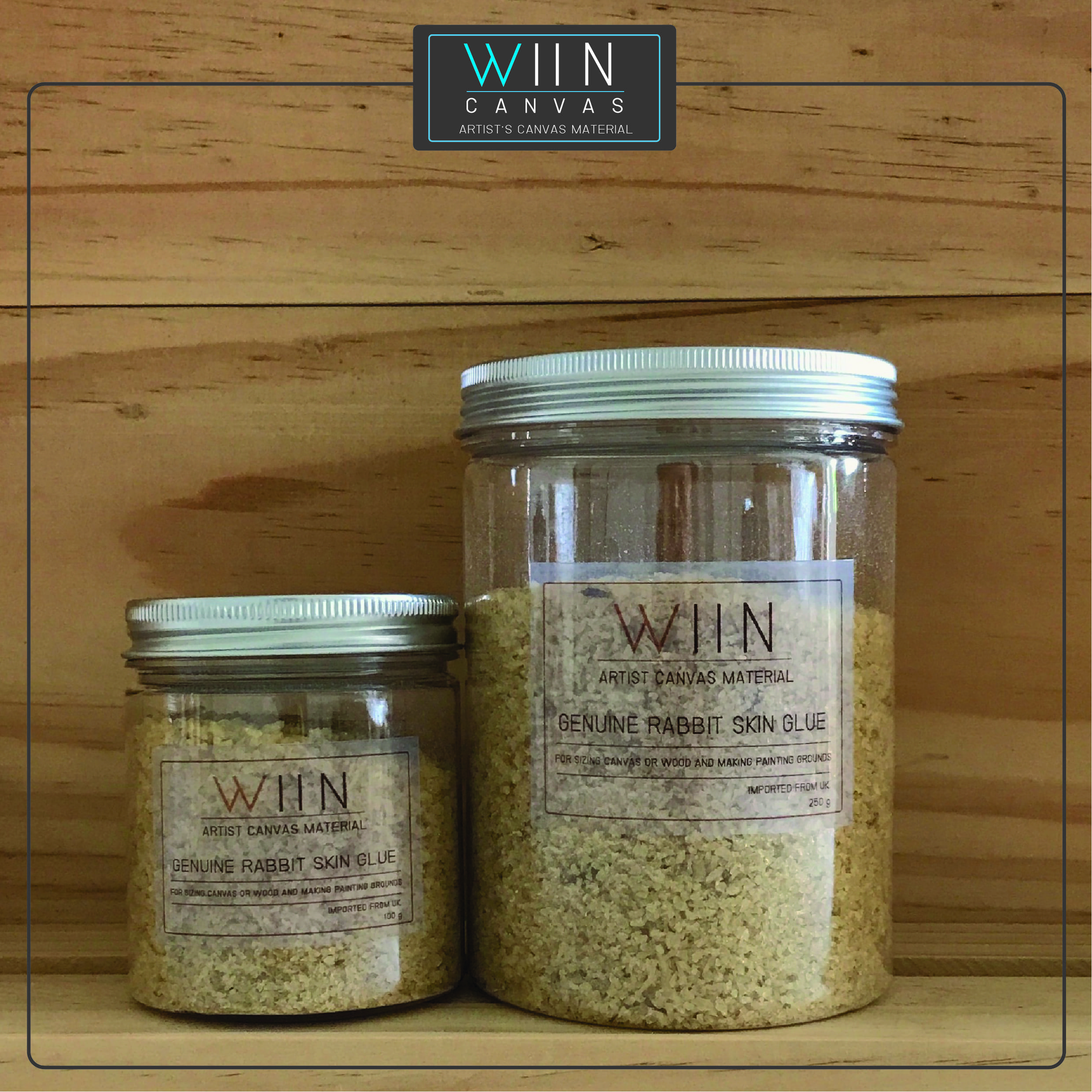
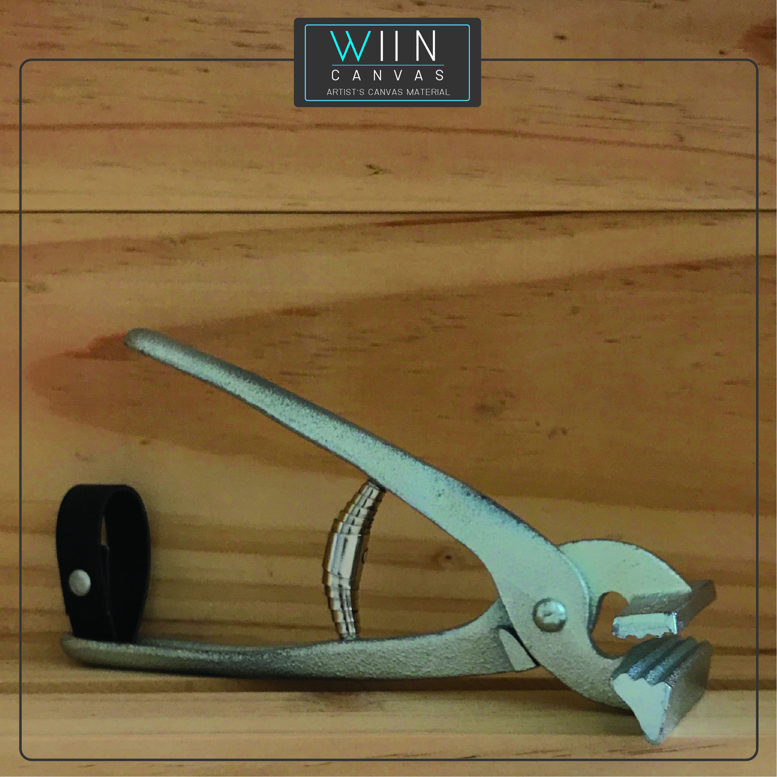
They have canvas of same dimensions of Belgian Linen (CLAESSENS?) and Ukrainian Linen available for as much as 40,000THB (Over $1000). They also carry canvas pliers, rabbit skin glue, and tacks. True old school.
WIIN CANVAS Supplier Info:
WIIN CANVAS
เลขที่ 125/23 ถ. เทศบาลพัฒนา 1 ต.เหมือง
อ.เมือง จ. ชลบุรี 20130
Addess
No.125/22 Tessaban Pattana 1 Road.
Mueang Sub-district
Muang Chon Buri District ,Chon Buri Province
20130
Thailand
Tel: – 086-678-5312 , 081-949-4586
Email – Wiincanvas@gmail.com
Cotton Canvas:
https://www.wiincanvas.com/categorycontent/915/cotton-canvas
Ukrainian Linen Canvas
https://www.wiincanvas.com/categorycontent/937/linen-canvas
Claessens Linen Canvas:
https://www.wiincanvas.com/categorycontent/1527/claessens-canvas
Additional Painting Studio Supplies:
Rabbit Skin Glue:
Canvas Pliers:
Zinc Canvas Tacks:
NANAPUN ART SUPPLY http://nanapun.net/
Oil Paints: http://nanapun.net/catalog.php?category=2
Acrylic: http://nanapun.net/catalog.php?category=3
Pastels / Stumps: http://nanapun.net/catalog.php?category=5
Brushes: http://nanapun.net/catalog.php?category=9
Brushes: http://nanapun.net/catalog.php?category=21
Buckets / Pallettes: http://nanapun.net/catalog.php?category=19
Tools: http://nanapun.net/catalog.php?category=22
ARTISTIC PAINTS CO LTD. https://www.facebook.com/Artistic-Paints-Co-Ltd-150034155092270/
THAI TONE WATER COLOR: https://www.facebook.com/thaitonecolor/
DG ARTS: http://www.dg-arts.com/en/
Oil Brushes: http://www.dg-arts.com/en/product.php?type1=015&type=015&pro=04
SOMJAI: https://somjai.co.th
Introduction:
Here are some excellent videos that I have used to quickly improve the voice quality in videos produced, -this guy knows his stuff, how to teach it, and keeps it simple enough to stay engaged. The best part is all the FREE plugins he puts us onto!
This Mastering Plugin is AMAZING for Voiceover, Podcasting and Music
A great video.
Here are some links:
https://en.wikipedia.org/wiki/Microtubule
https://www.google.com/search?client=ubuntu&channel=fs&q=collapse+of+wave+function&ie=utf-8&oe=utf-8

https://en.wikipedia.org/wiki/Sirius
https://en.wikipedia.org/wiki/Isaak_Markovich_Khalatnikov
https://en.wikipedia.org/wiki/Schwarzschild_radius
https://math.stackexchange.com/questions/1870476/hairy-dog-theorem
https://www.google.com/search?client=ubuntu&channel=fs&q=singularity&ie=utf-8&oe=utf-8
https://en.wikipedia.org/wiki/Technological_singularity
https://en.wikipedia.org/wiki/Singularity
https://www.google.com/search?client=ubuntu&channel=fs&q=cosmlogical+constant&ie=utf-8&oe=utf-8
https://en.wikipedia.org/wiki/Cosmological_constant
New evidence for cyclic universe claimed by Roger Penrose and colleagues
https://www.google.com/search?client=ubuntu&channel=fs&q=hawking+pionts+in+the+CMB+sky&ie=utf-8&oe=utf-8
https://arxiv.org/abs/1808.01740
https://www.prnewswire.com/news-releases/hawking-points-in-the-cosmic-microwave-background-300698280.html
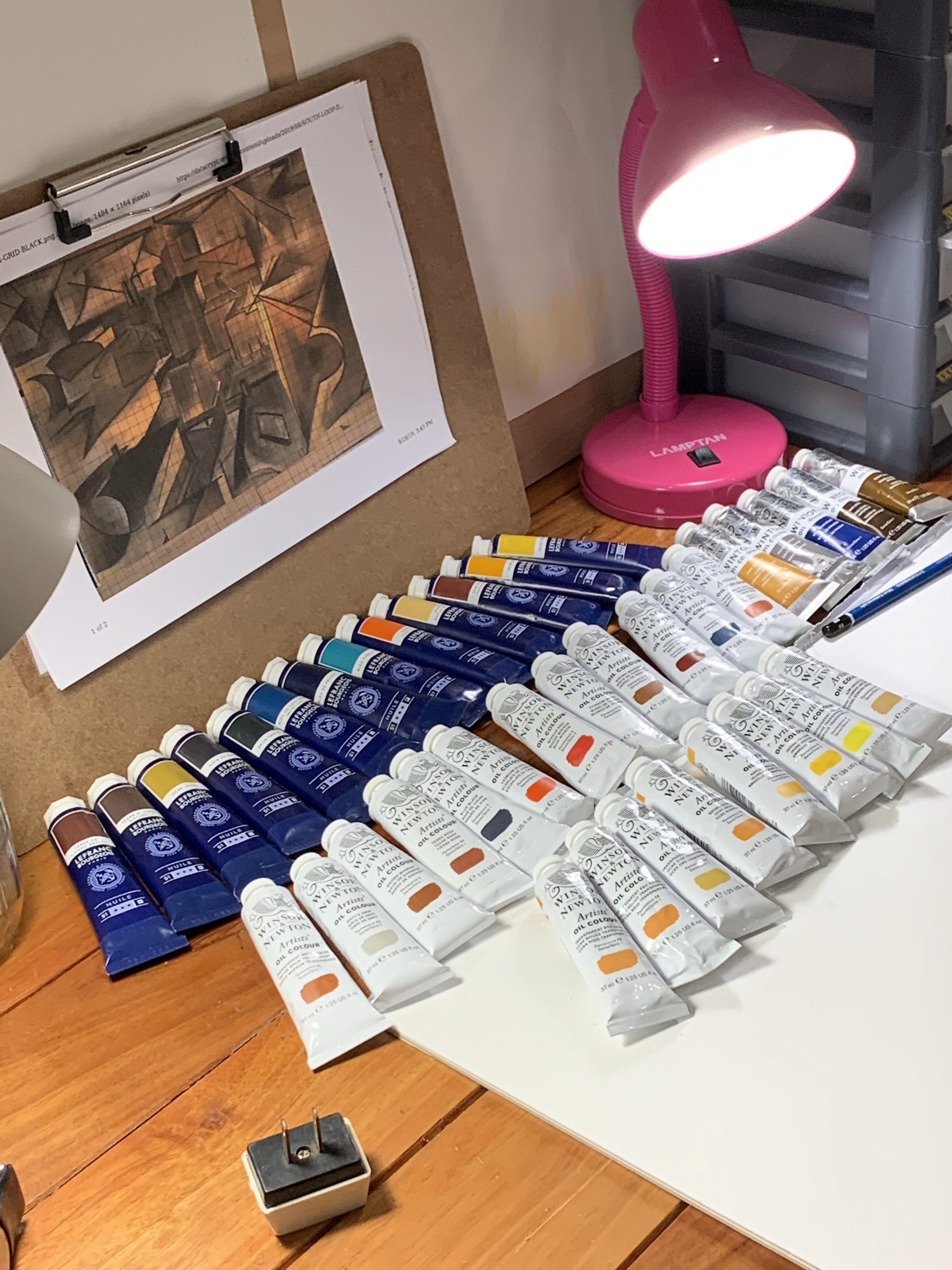
Southloop II has been a long time in planning. Even now, until it’s done, I am unsure of it’s completion date.
Tonight is a first effort at a “night studio” operation. I’ve cleared some space, and given thought to various options and have decided to start out with drawings.
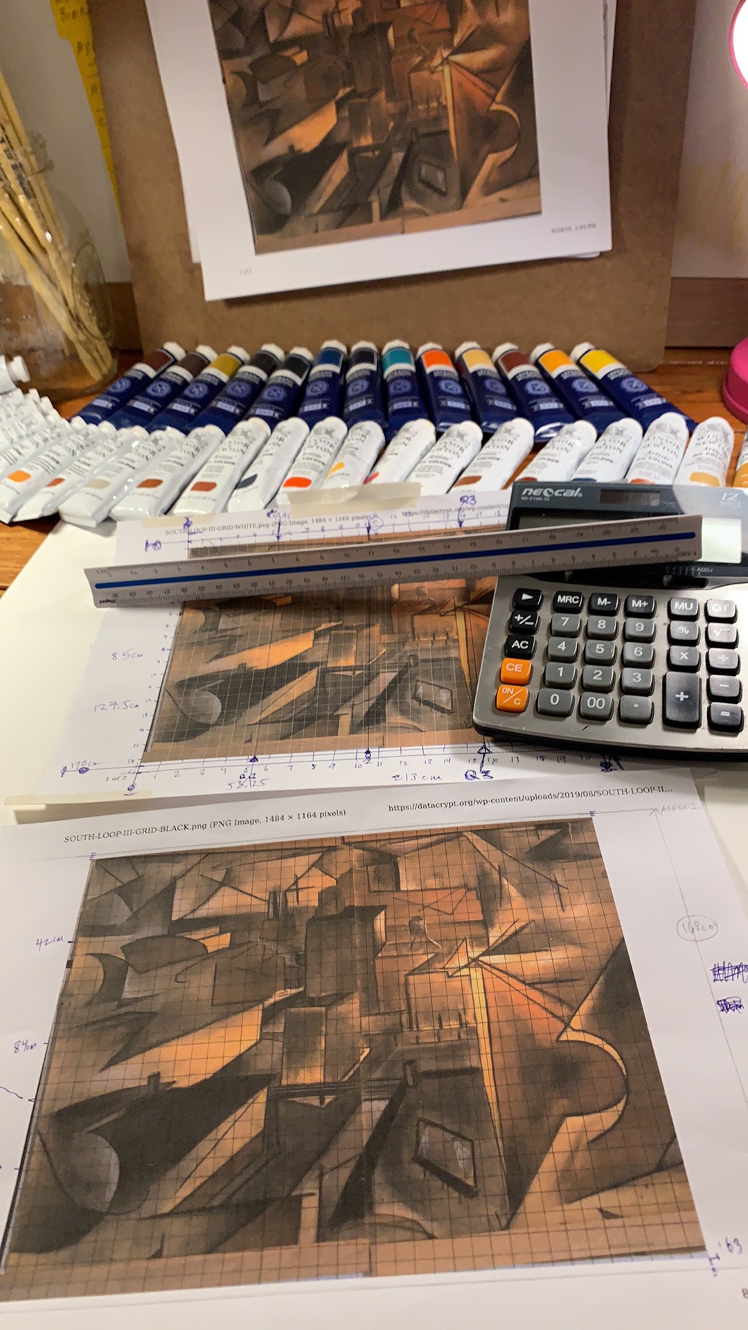
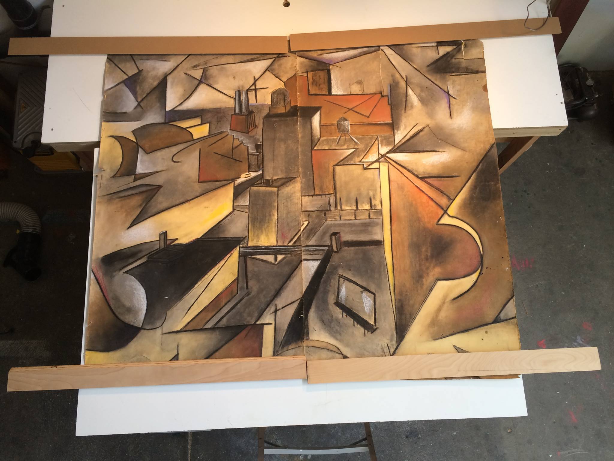
Here’s the source. I did this when I was 19. I’m 49 now. Why am I doing it? After a 10 year hiatus from studio time, spent living overseas, it took this long to form back up from the dust and matter, into a solid entity with capacity to resume this discipline, pastime, undertaking. So the answer as to why is, -it’s a starting point.
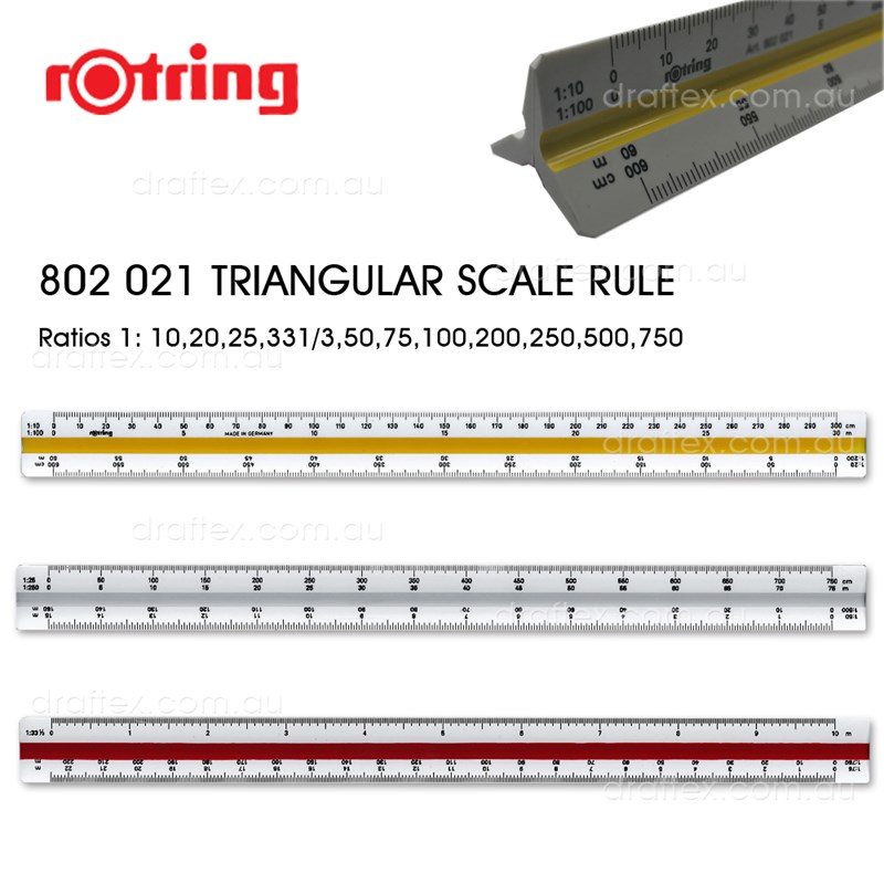
So after a few hours of using Grids made by hand, and quite a few “Scale” options like the tool below:
Here’s how far I got before realizing the boundaries might not work on first try.
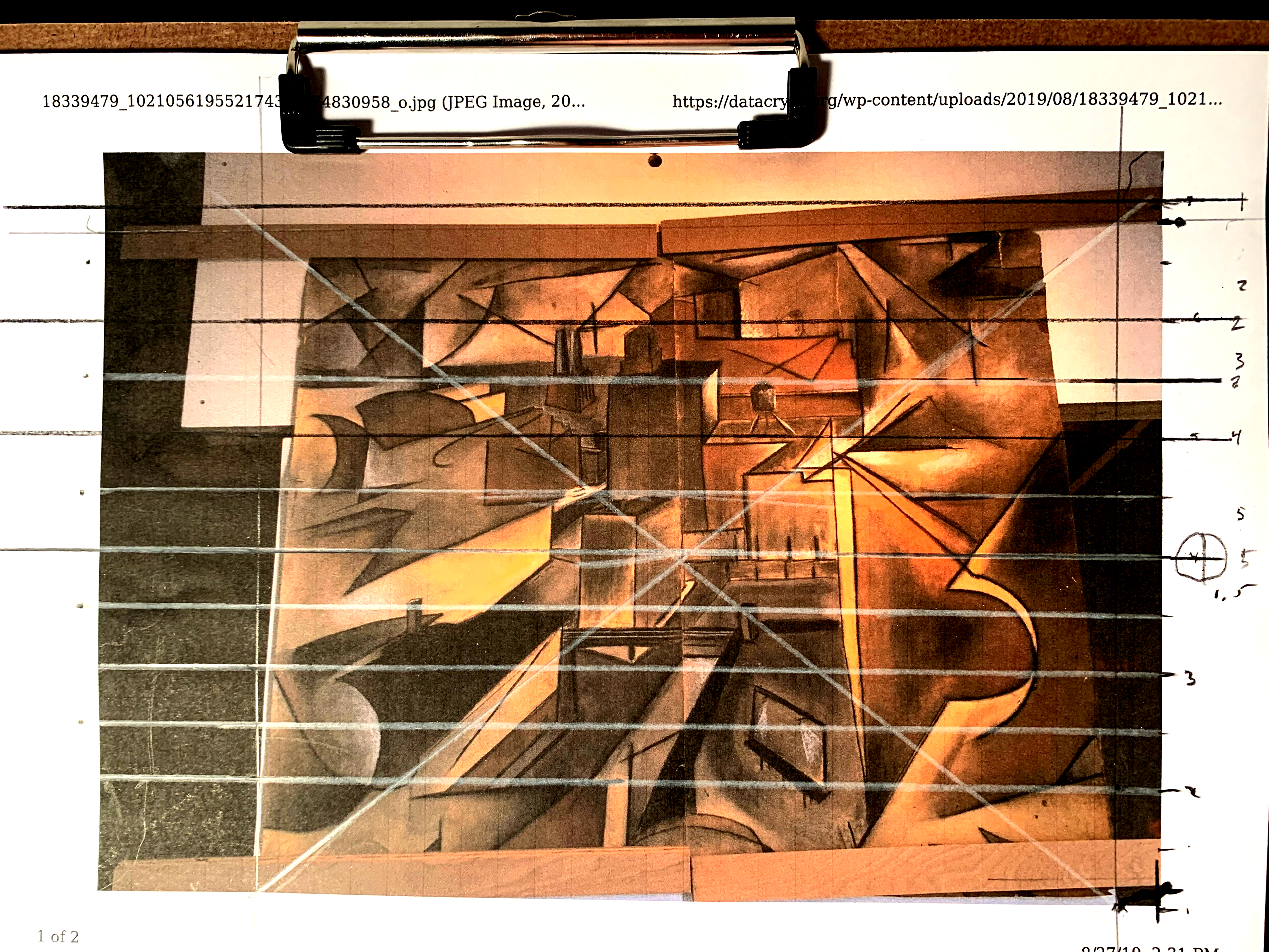
I then decided why not use some electronic means to fix the perspective issue, as really the photo was quite difficult to solve.
Now it’s better. This seems to not be a perfect square. 30 years one forgets.

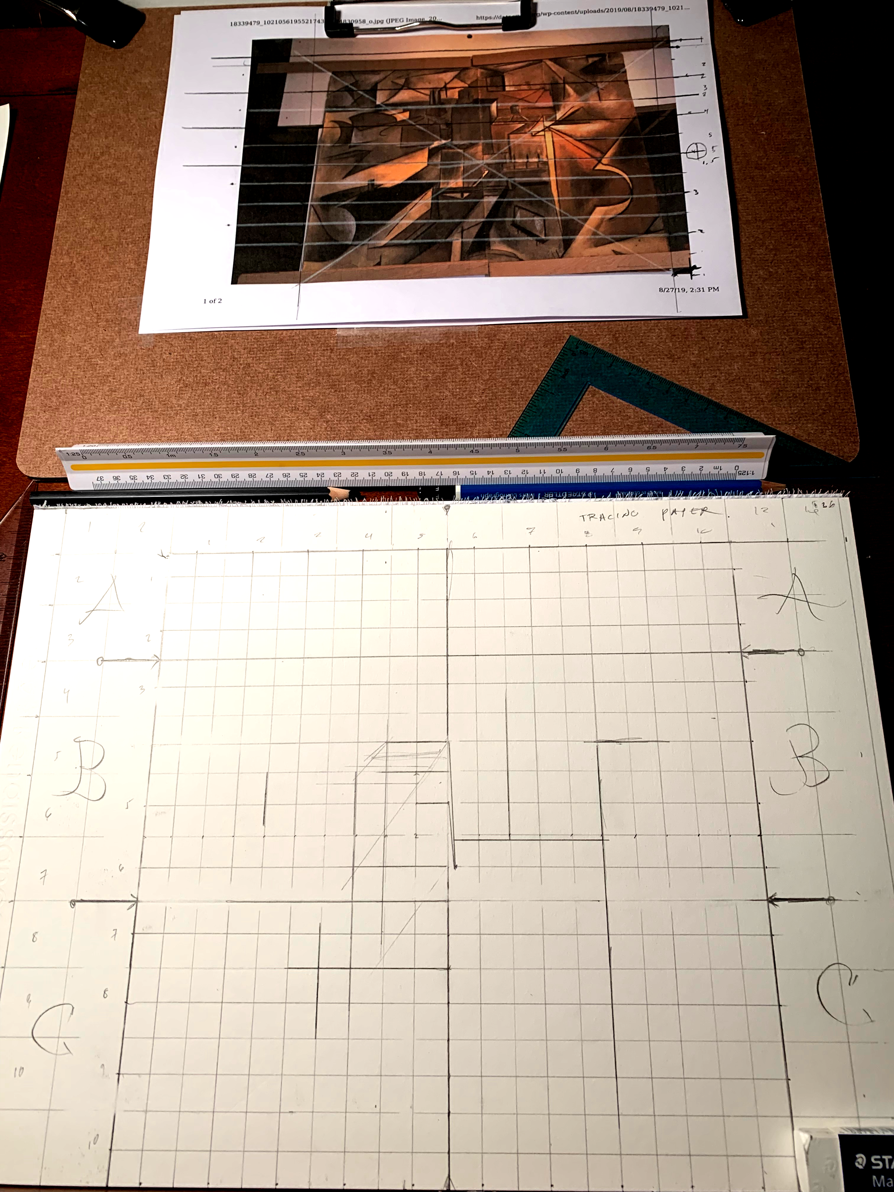
So then it was GRID time.
And GRID WE DID.
And why not, BLACK GRID TOO for the white areas.
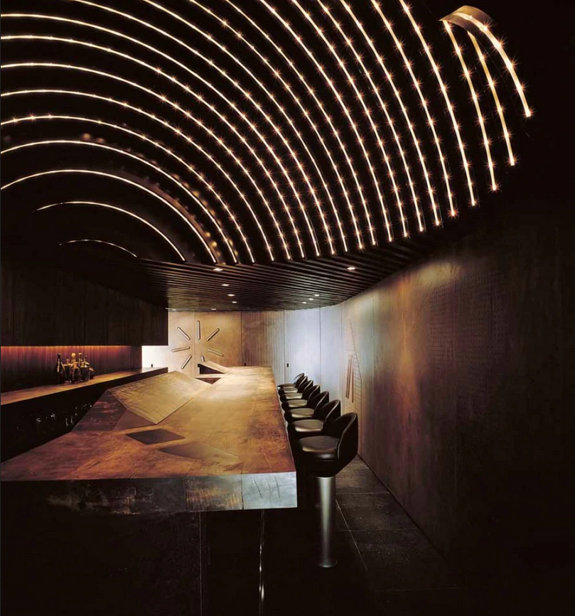
In the history of architecture or interior design there are plenty of great figures to appreciate and study. But in the current era things are going so well one need not look in the rear view mirror.
One such architect who exemplifies this in terms of accomplishments and sheer talent, is Takashi Sugimoto, and his Super Potato Design Studio.

These few images by no means encompass his aesthetic range.
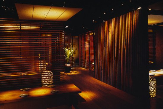
The few I have included up top, all have a common feature. The shape known as rectangle. I’d call Sugimoto King of Rectangles or King of Tables, but that’s in jest. I do respect him far more than this. But as a painter who looks to bridge the oil and canvas medium as close to the edge of other disciplines like photography, architecture, and digital media, this guy’s work gives some excellent visual experiences, better ways to connect, something to lock onto.
As in the end, Architecture is relative to Geometry. And the physics of light is one of the greatest allies. So is the knowledge of physical textures, surfaces, and how light and shadow interact with them.
My work in oils and drawings is done as I am not able to transform into an architect, and even if I were, I would likely never have had the career this man has had. But the next best thing, and even better sometimes, is to follow, appreciate, and reflect upon the work.
https://www.interiordesign.net/articles/8459-takashi-sugimoto-2008-hall-of-fame-inductee/
Asked to define the philosophy behind his practice, Sugimoto often refers to a trifecta of ideals: creation, communication, nature. “I work at creating places that allow communication between people and incorporate a sense of nature,” he explains. “But not nature simply as it is.” This last distinction was memorably demonstrated in Tokyo’s Shunju Akasaka, a restaurant he designed in 1990 where diners sat at a counter facing a small internal garden set behind glass. This is nature under the human hand, and it’s an important element in any Super Potato project, whether expressed by a lone tree in a vitrine at the center of a restaurant or the thick slab of roughly hewn cherry, full of knots and cracks, that served as a counter at one of Super Potato’s earliest designs, the tiny but legendary Radio, a Tokyo bar from 1971.
“Radio was a place where my friends and I got together and had a few drinks,” he says of the nine-seat watering hole. “Then, eventually, other people would come in, not expecting the unusual design, and we would all wind up talking about it.” Ever since, Sugimoto has kept the communicative aspects of his interiors firmly in mind. Sometimes this has led to bold, theatrical gestures such as the open kitchen as dining room entertainment, an idea he pioneered in 1998 at Singapore’s Mezza9 restaurant, his first big international success.
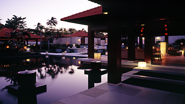
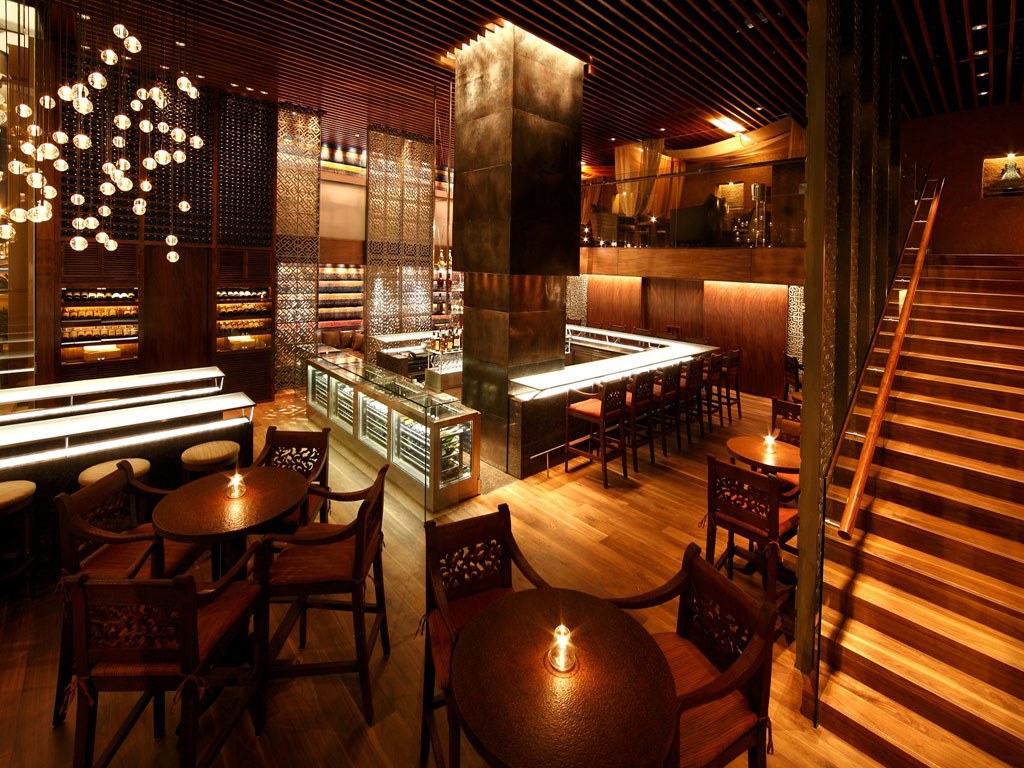
Here’s a couple from a particular hotel / resort that shows both natural and manufactured light, mixed in with architectonic forms.
It’s just a simple resort really, but a lot of thought went into the details. Can it be taken abstract? Or Deconstructed into Cubism? Can the lines be Grafittized? The palm trees are almost like a form of visual encryption. Their lines far harder to replicate.
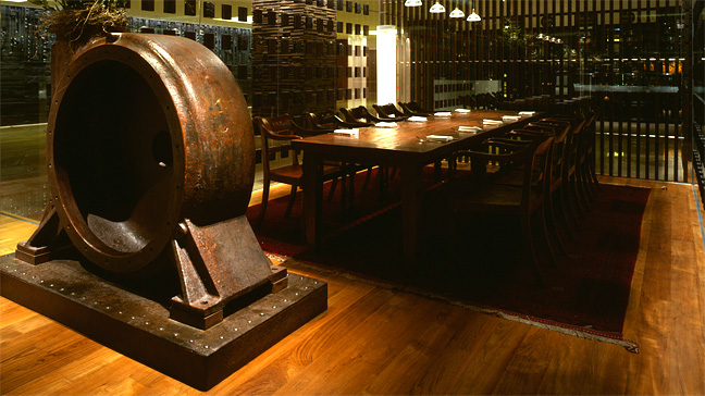
Here’s more of the King of Right Angles in play, on the back cover of a book about him.
Now mixing more angles.
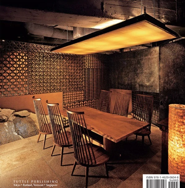
I like the closed in spaces here as they seem conducive the drinking and intimacy. You can confide in spaces like this. You can be alone with your thoughts in spaces like this. Time can be halted or slowed here.
This is no ordinary blog, it’s not for you unless you wish to live forever, travel through time, see everything. Why else would it cover the fine arts, architecture, digital arts, physics, astronomy, astrophysics, programming, Linux, cryptography, etc.
Even the architect probably desires to be away from all the hotels and resorts and such, but in this era they are whom have the gold.
Here’s Grand Hyatt Singapore


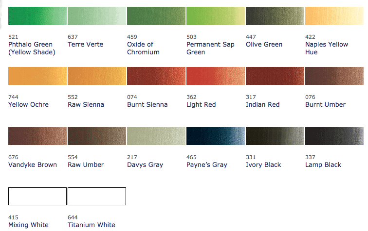
There are tons of references, one I like that covers portrait palettes is here:
It lists the basics of:
And even better:
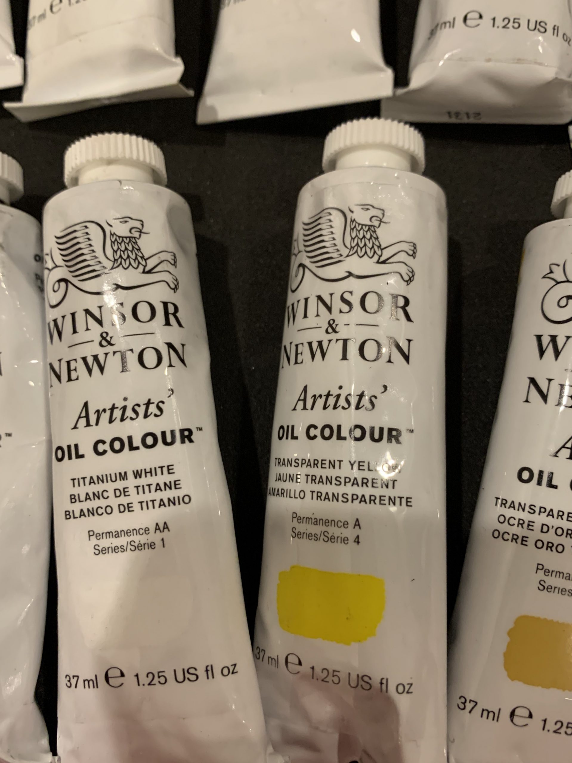
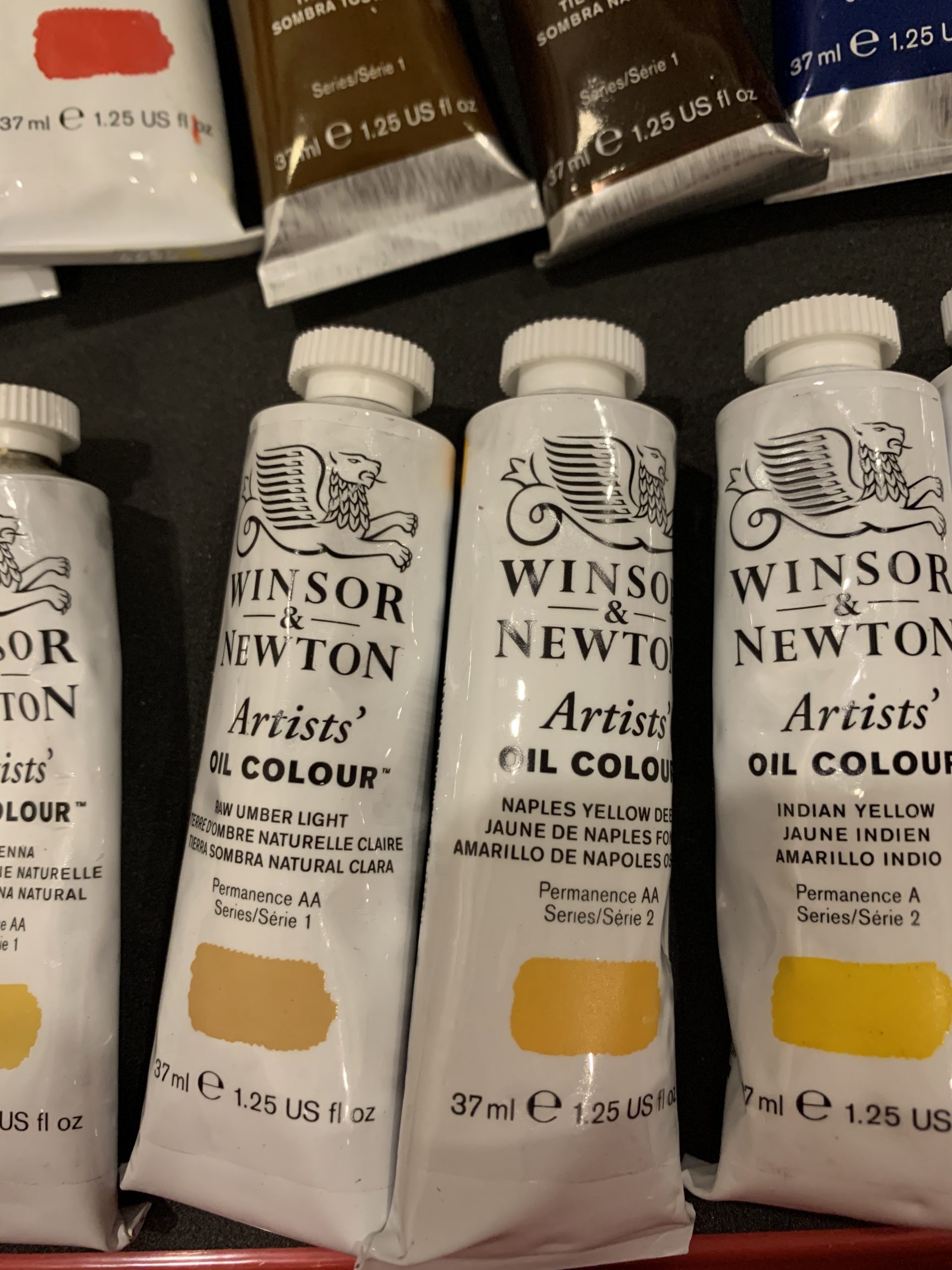
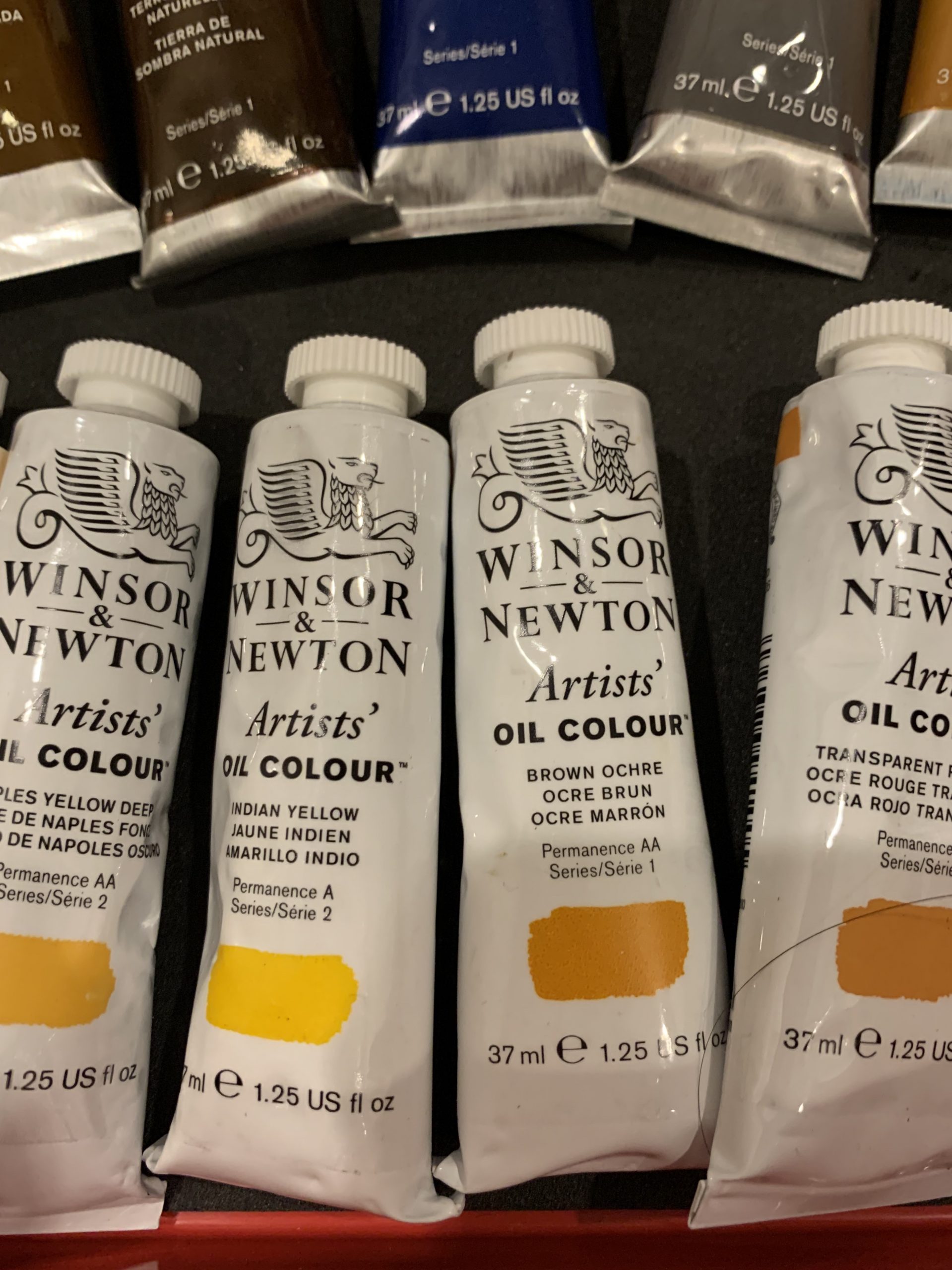
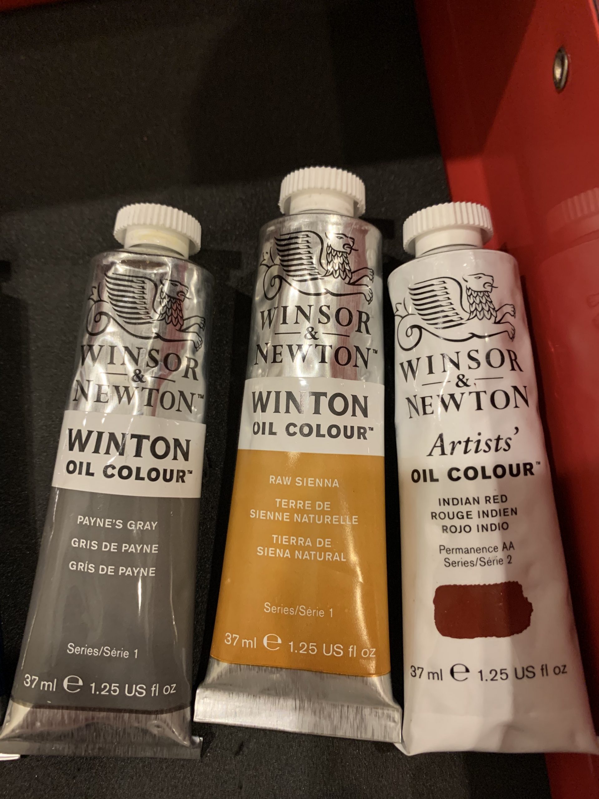
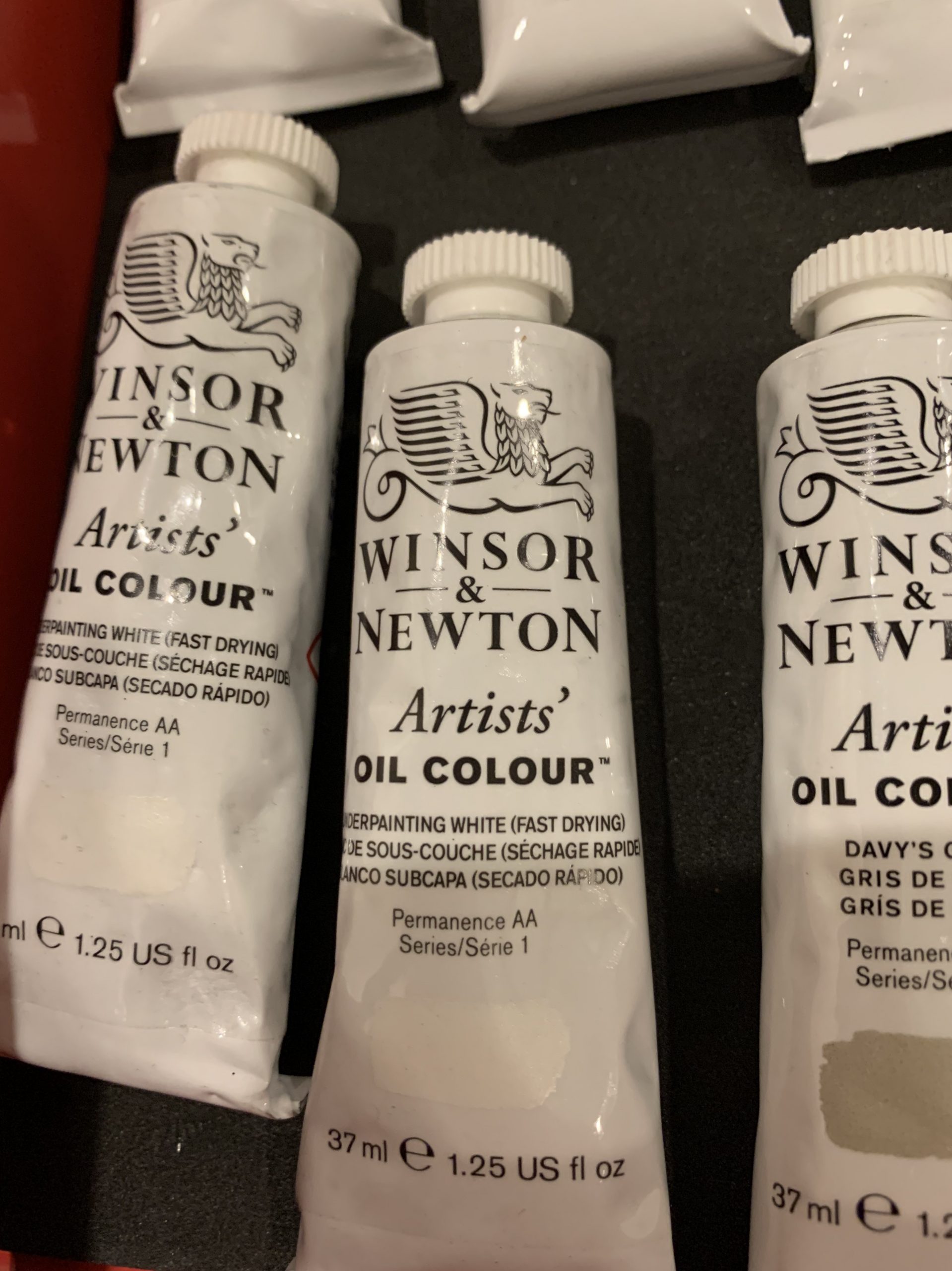
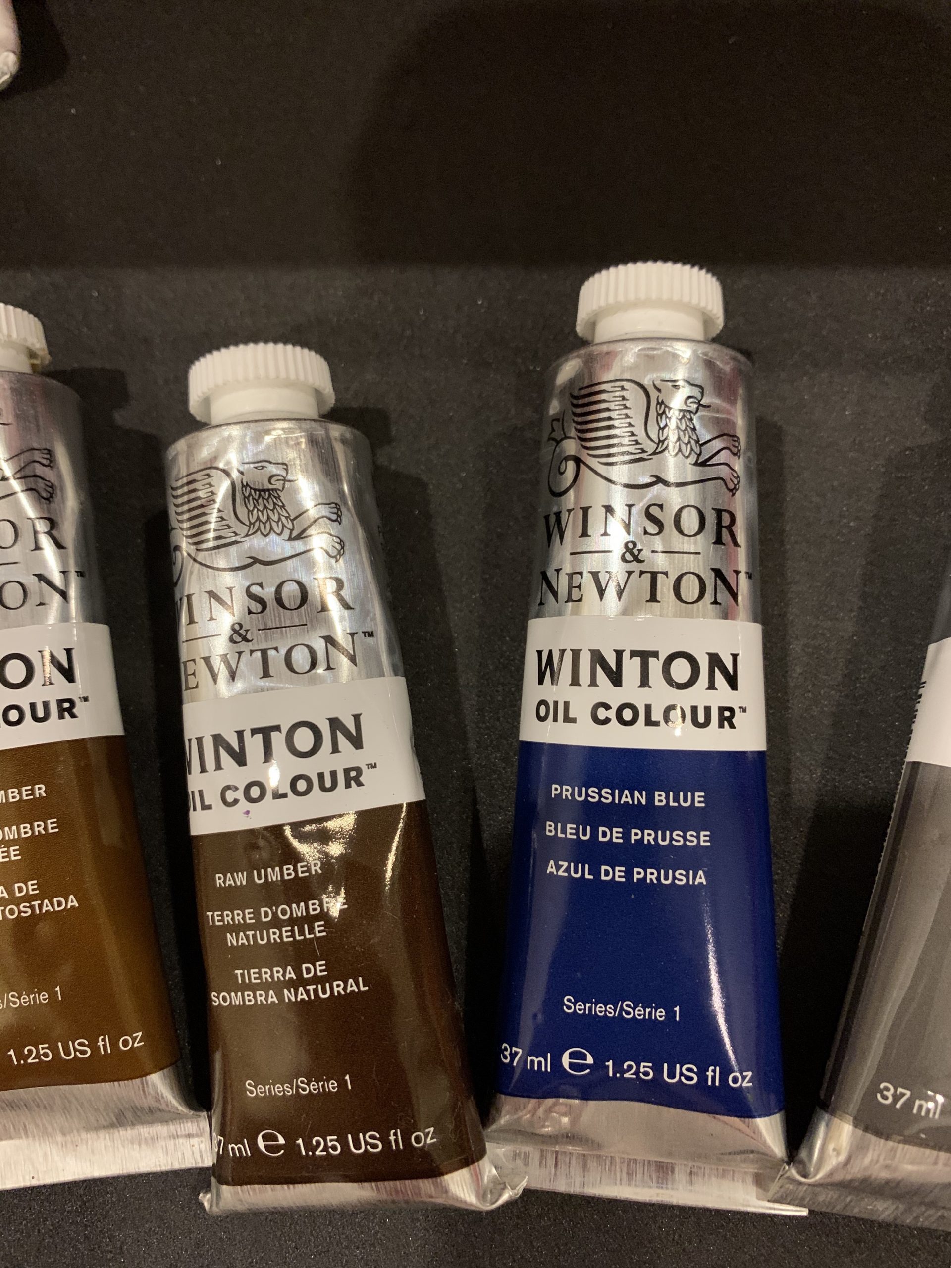
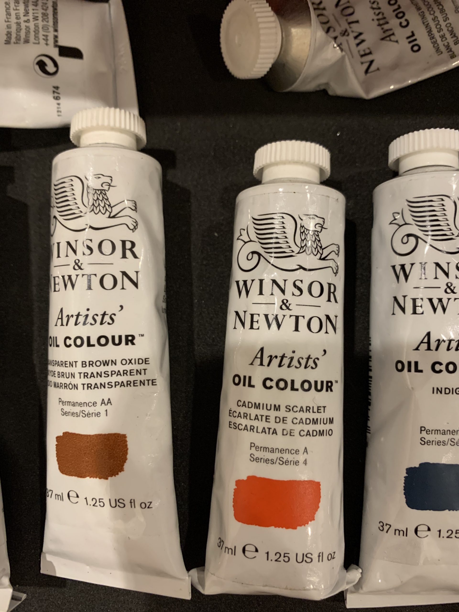
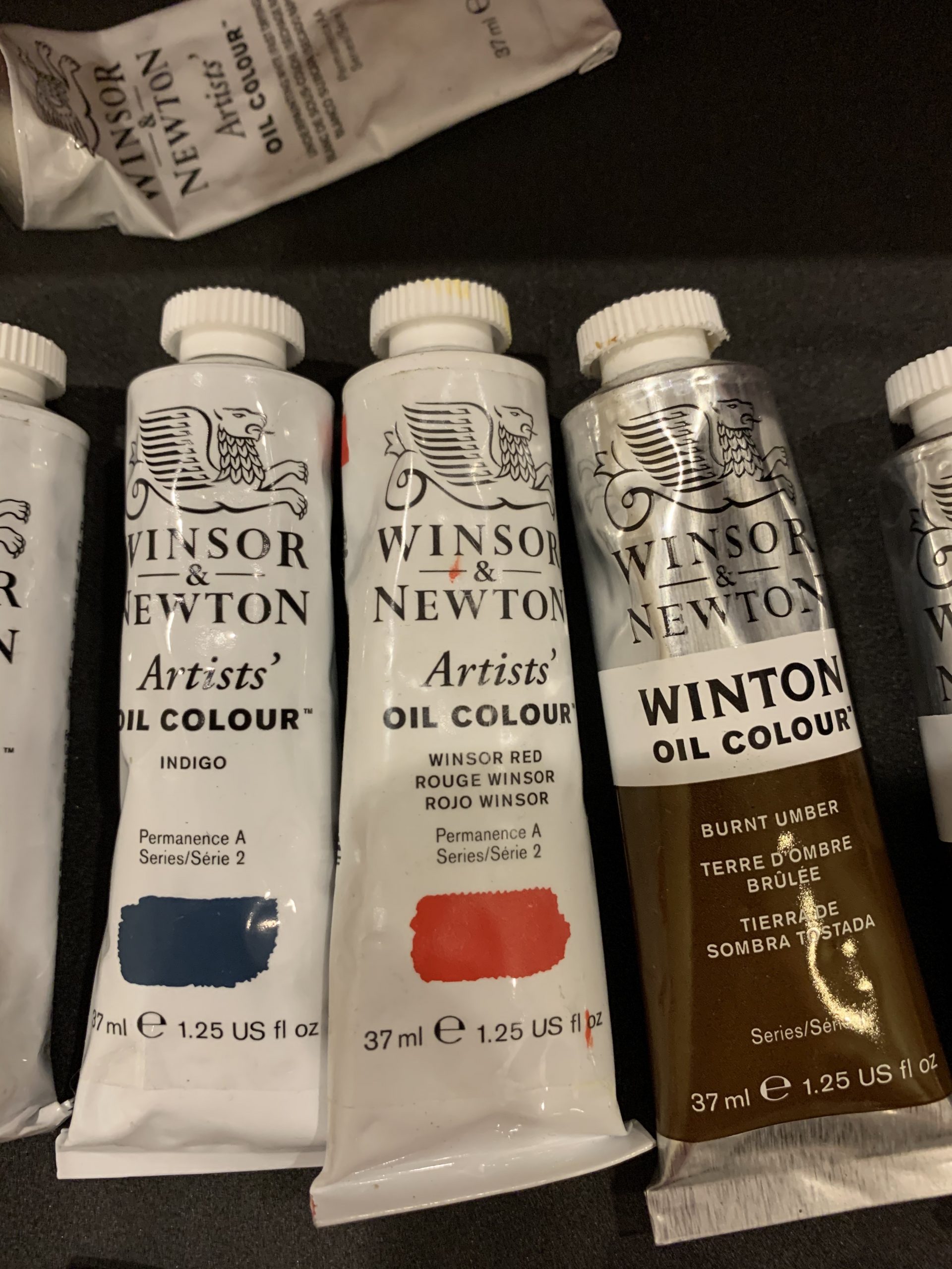
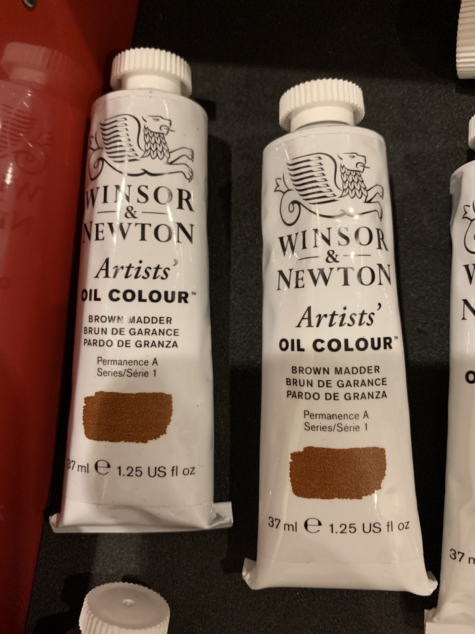
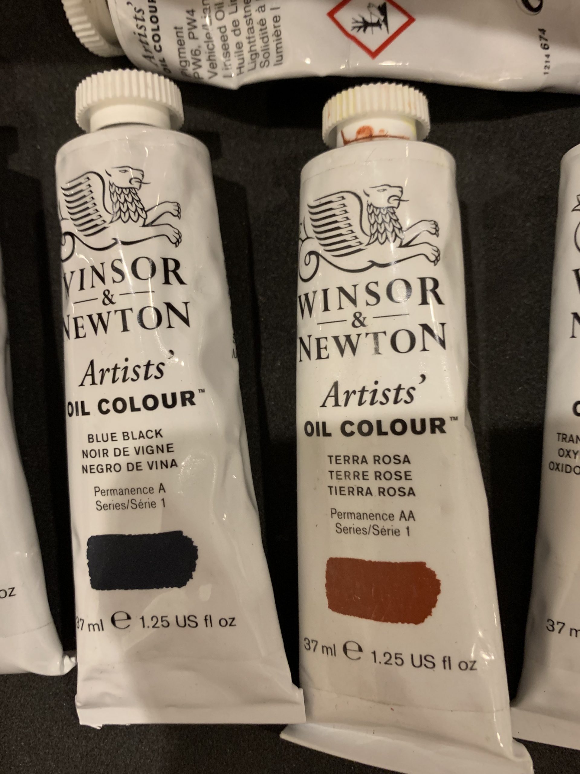
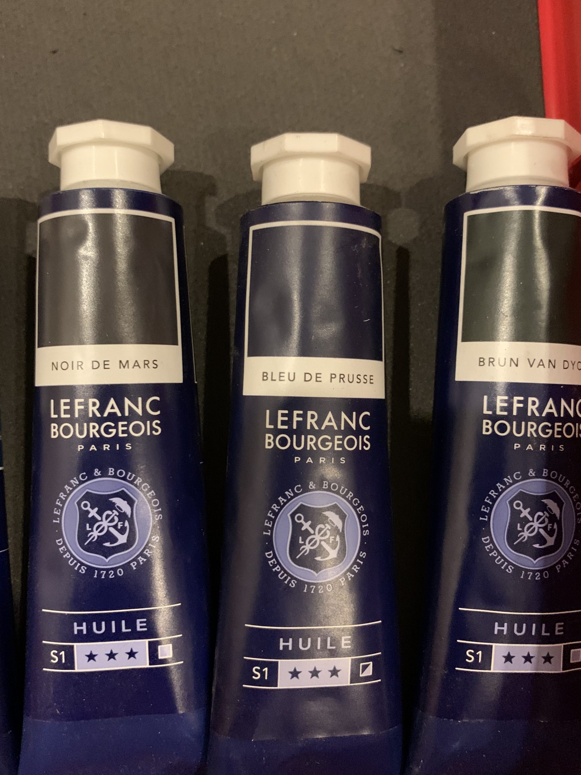
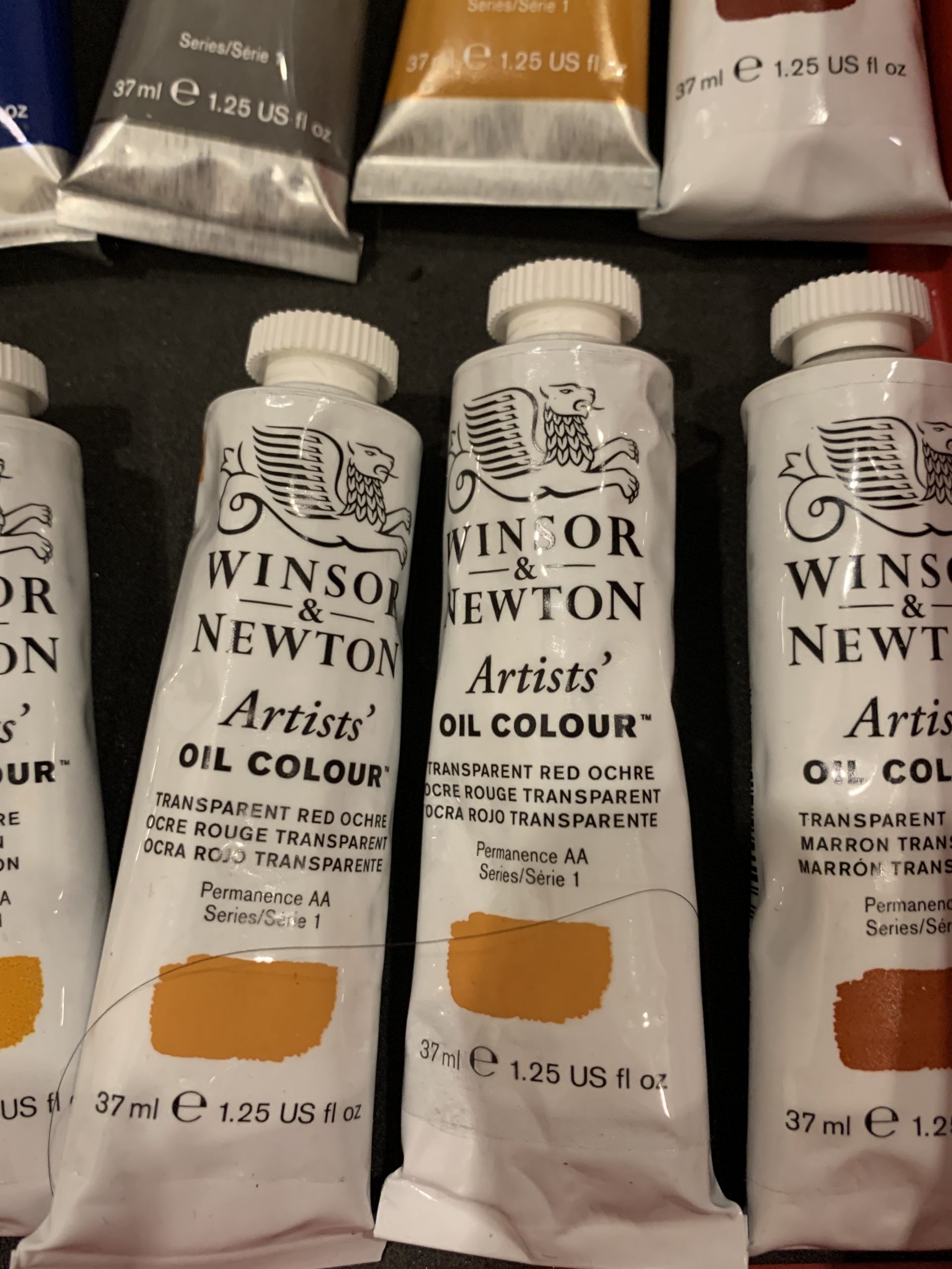
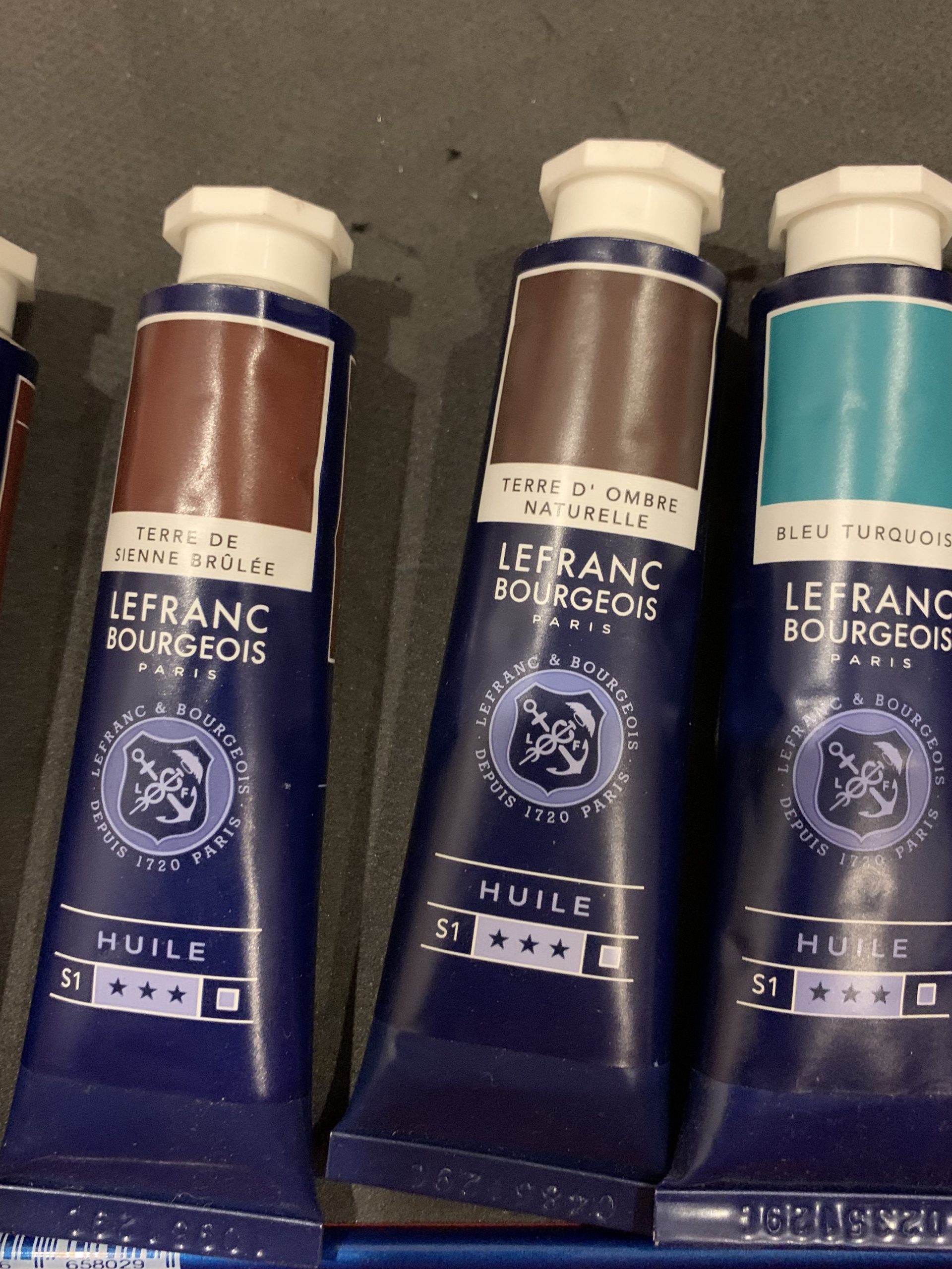
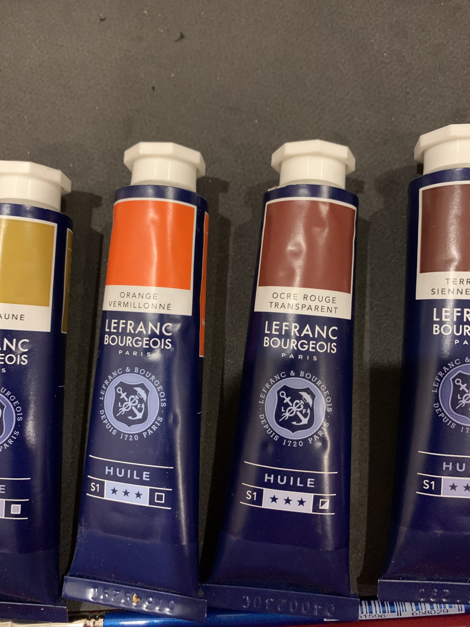
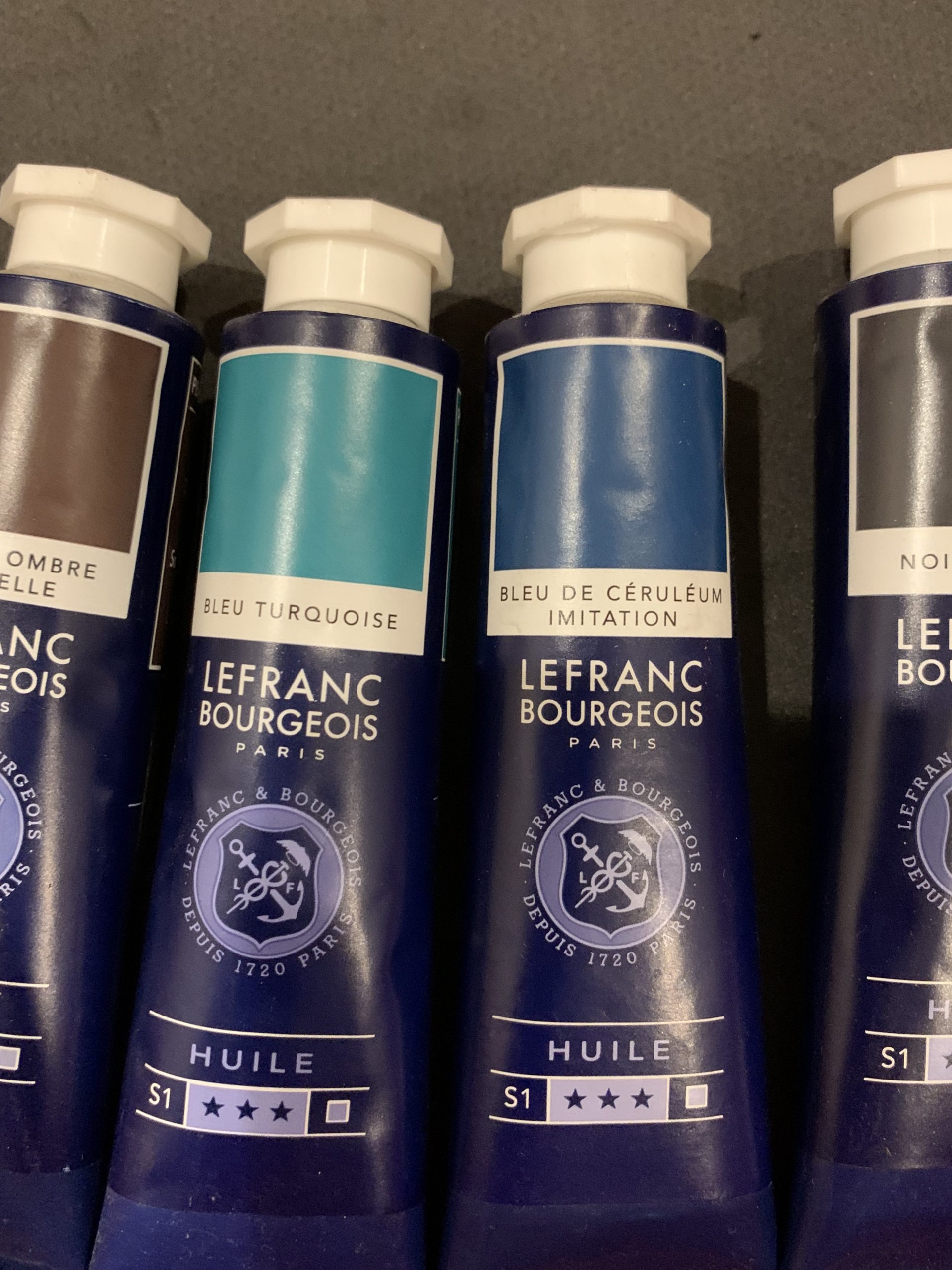
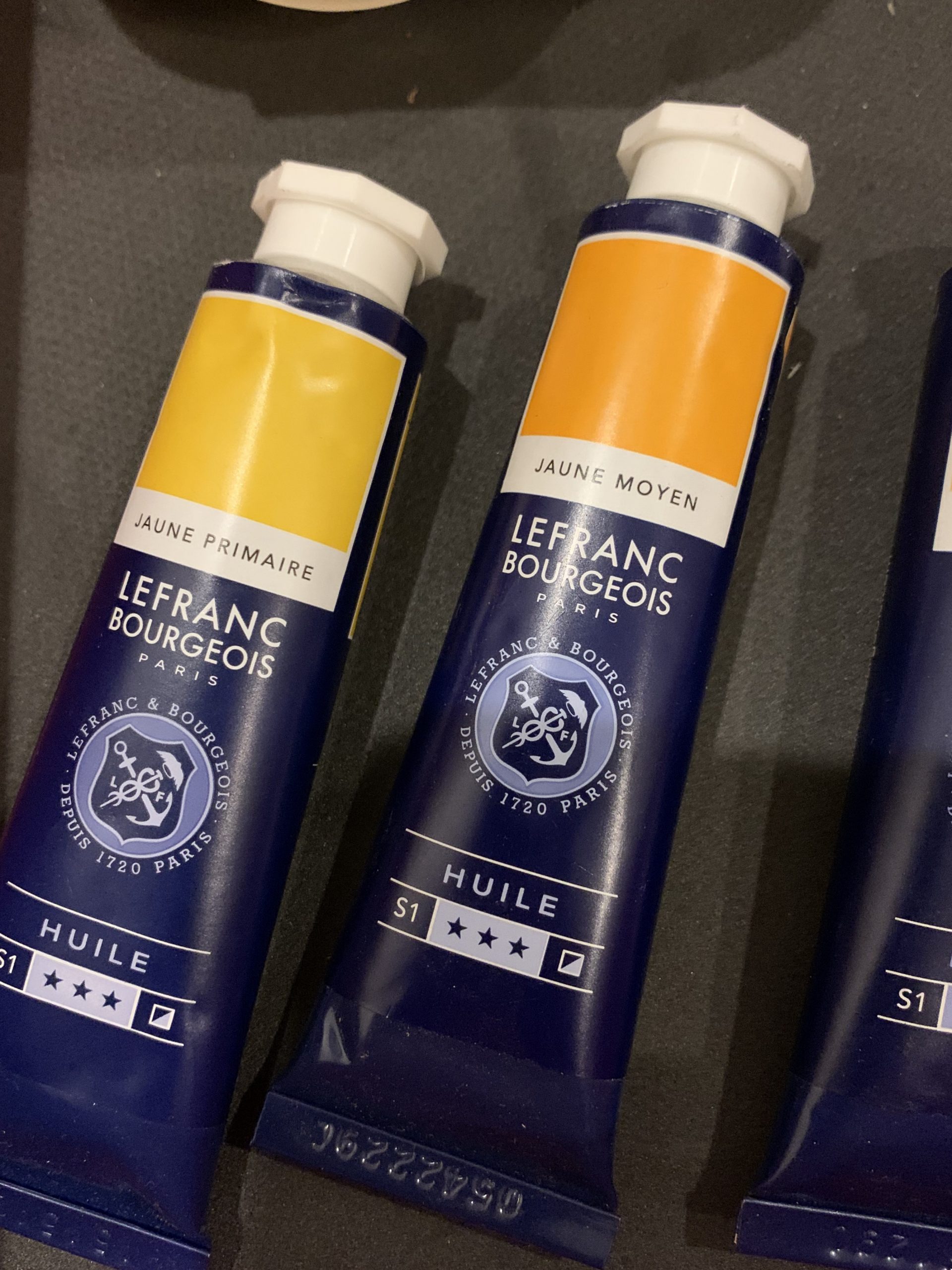
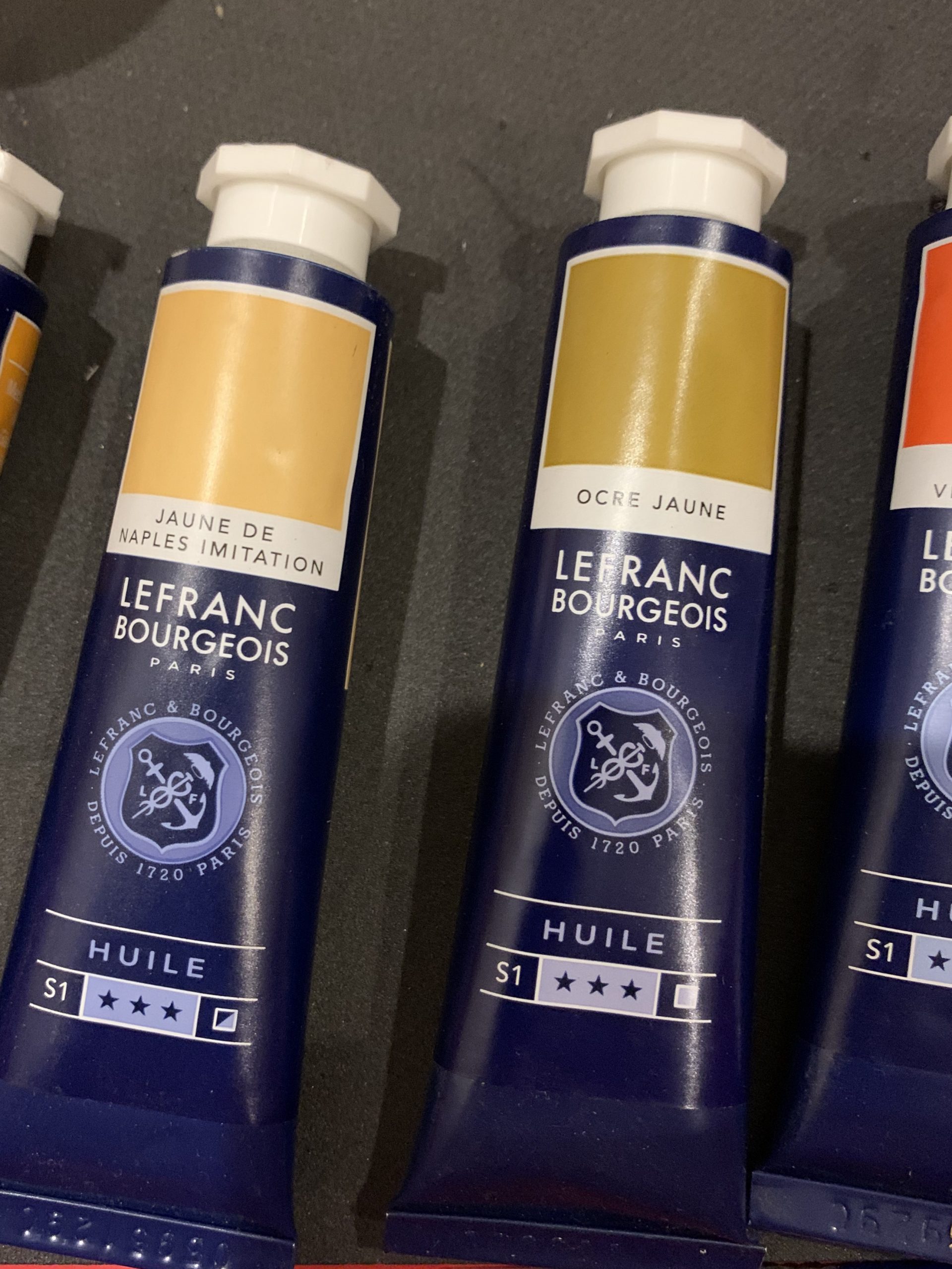
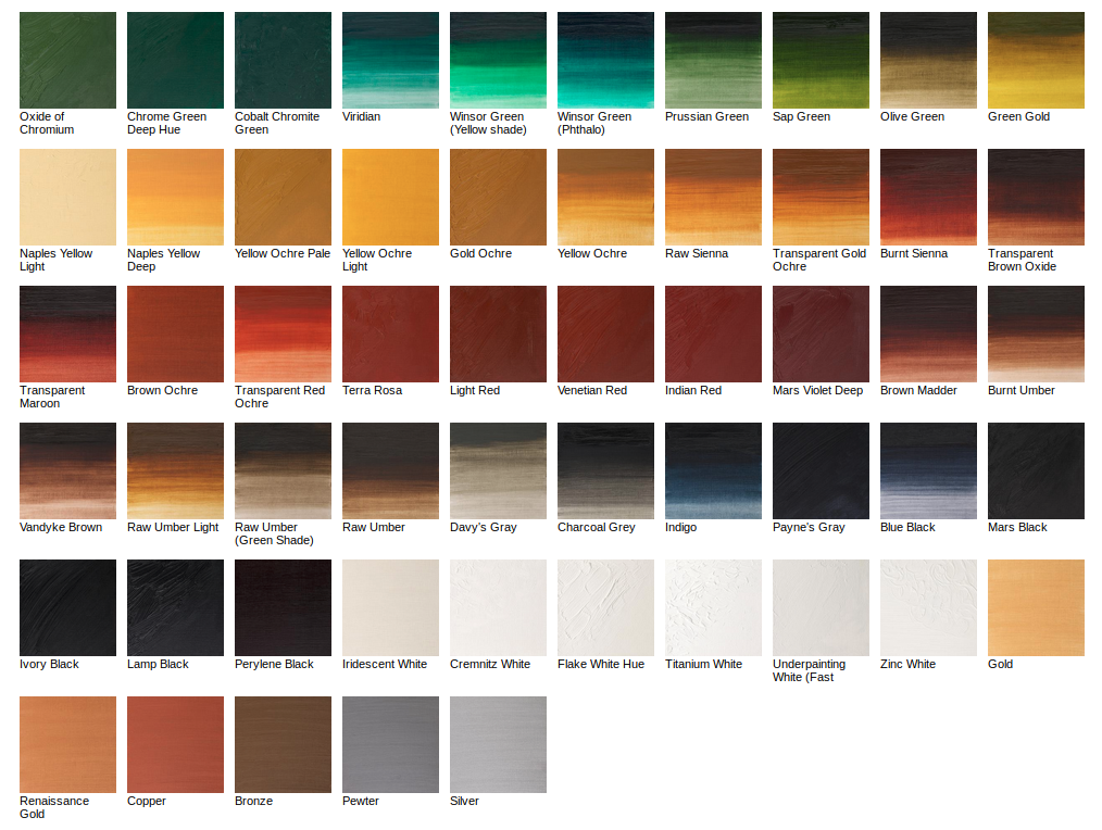
Here are the color charts I am starting to collect, first the portrait one.
This post will likely get split into may different ones covering the various paint manufacturers I use.
Old Holland -Artist Oil colours

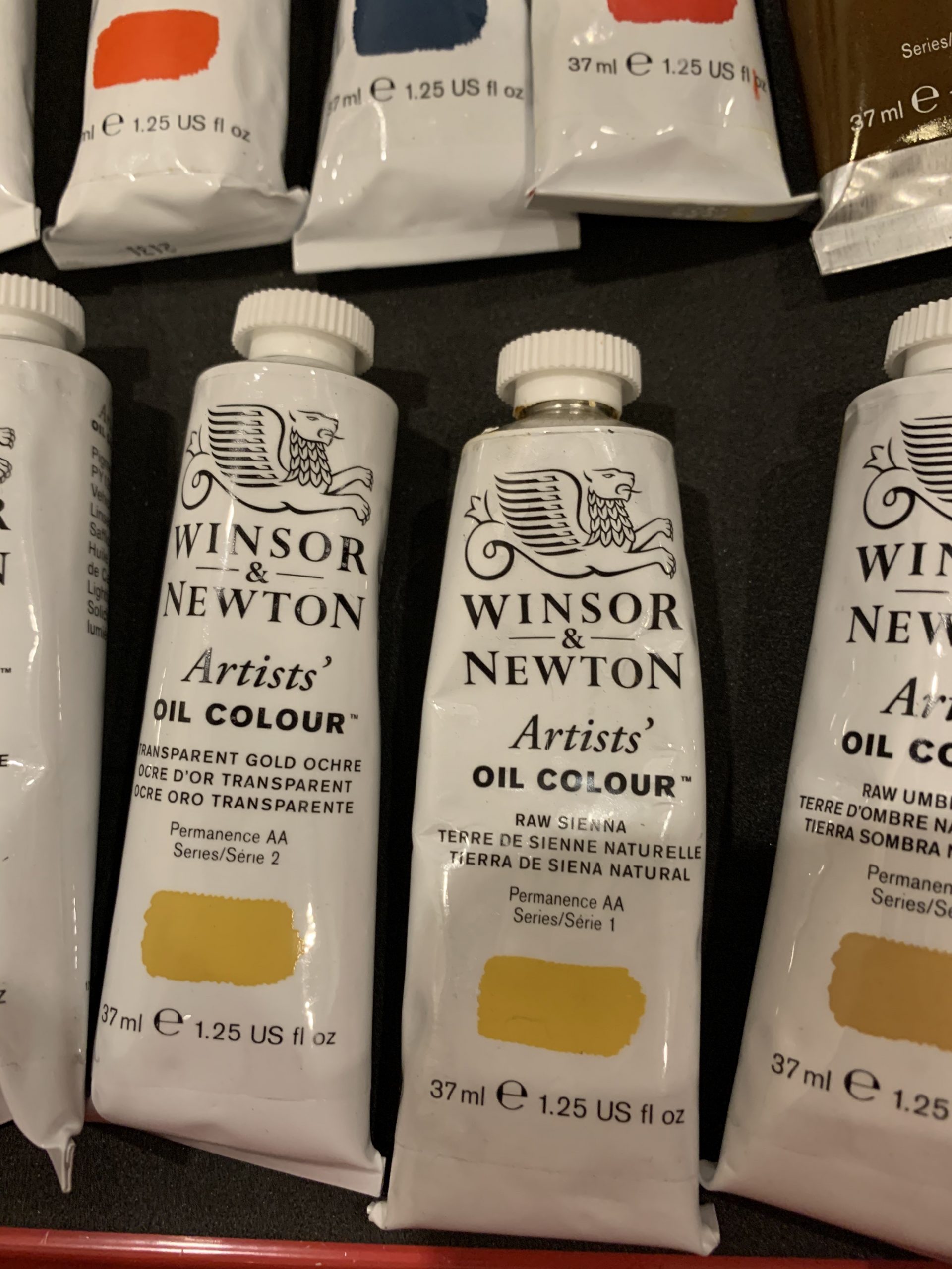
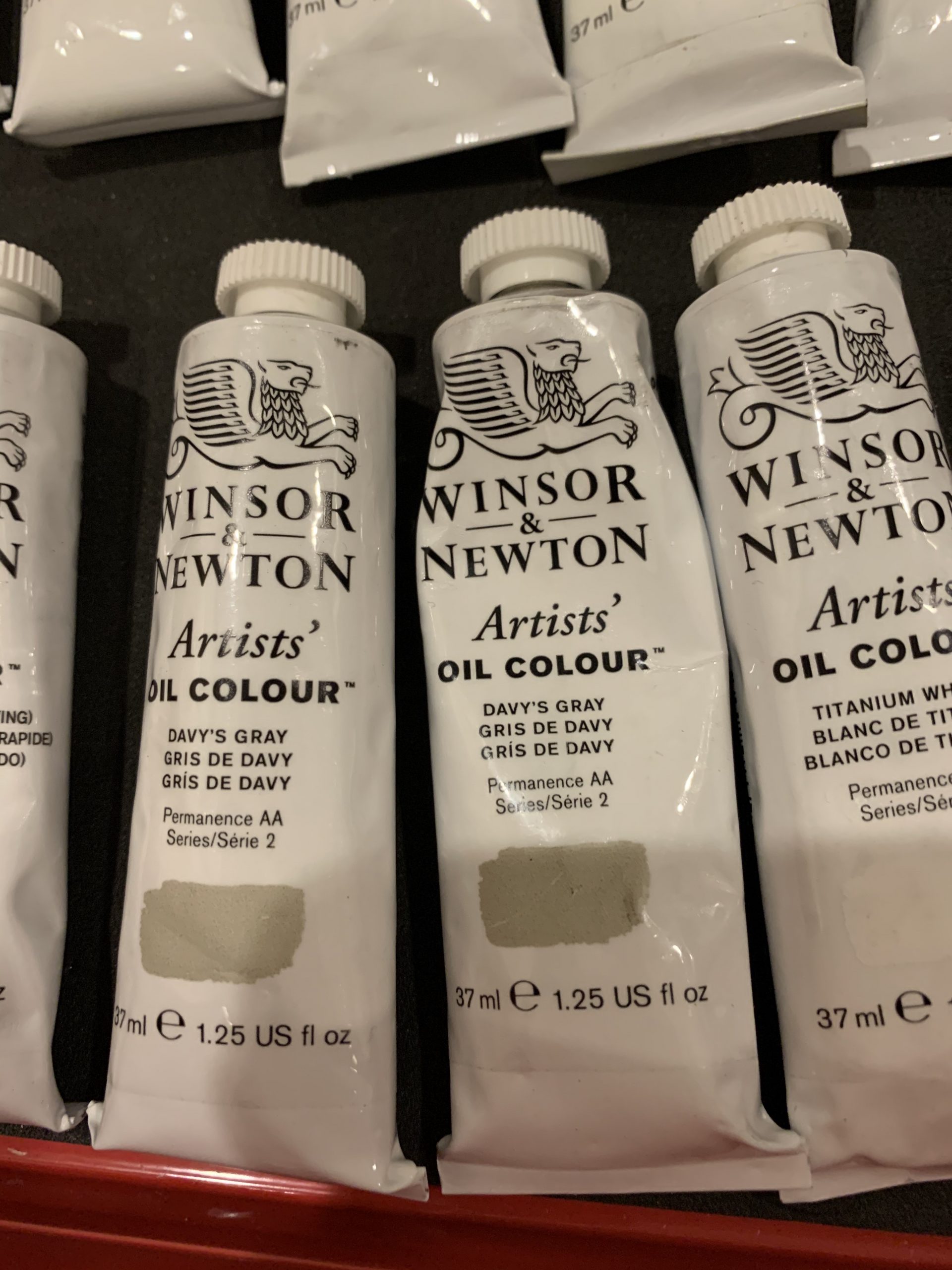
Winsor & Newton – Artist oil colours

Winsor & Newton – Student quality Griffin quick drying oils
Winsor & Newton – Student quality Griffin quick drying oils
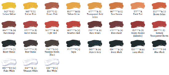
Daler Rowney – Student Quality Georgia oils
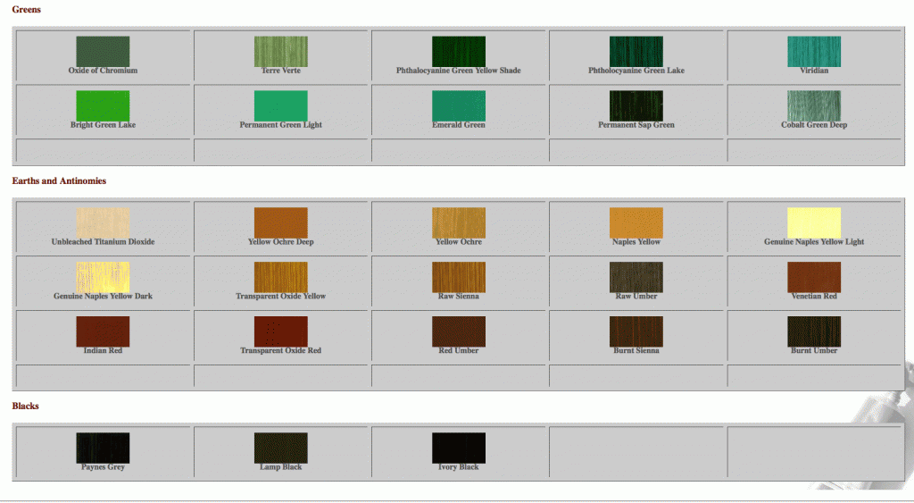
And now onto actual Palettes from Manufacturers, first up, Windsor Newton ARTIST’S OIL COLOR:

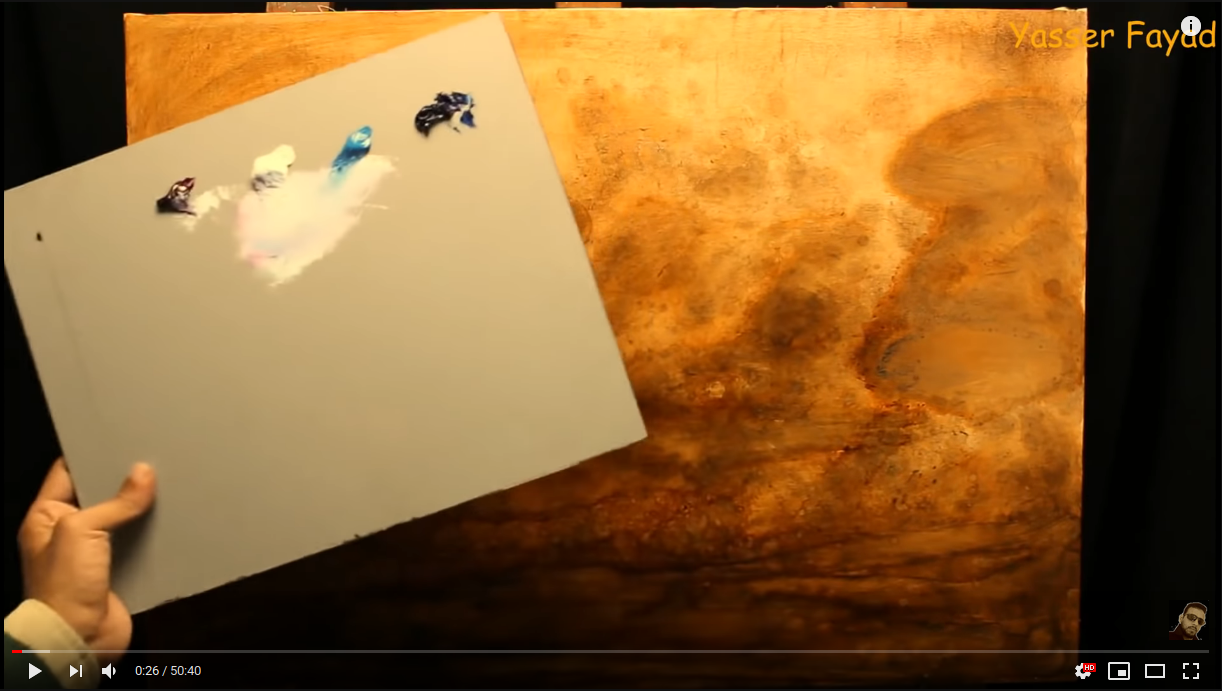
In the line of videos I have been watching I have found one guy who’s videos I like and who displays a good sense of touch, using different hand angles.
Also his approach is very simplified, just using a very standard palette board and a limited selection of colors. Yet he makes the most of it.
I don’t paint in this style and I generally don’t like brush strokes to show, but the point for me here is his overall composition, and how he has sped up the video to cover the whole process from start to end.
He starts with this.
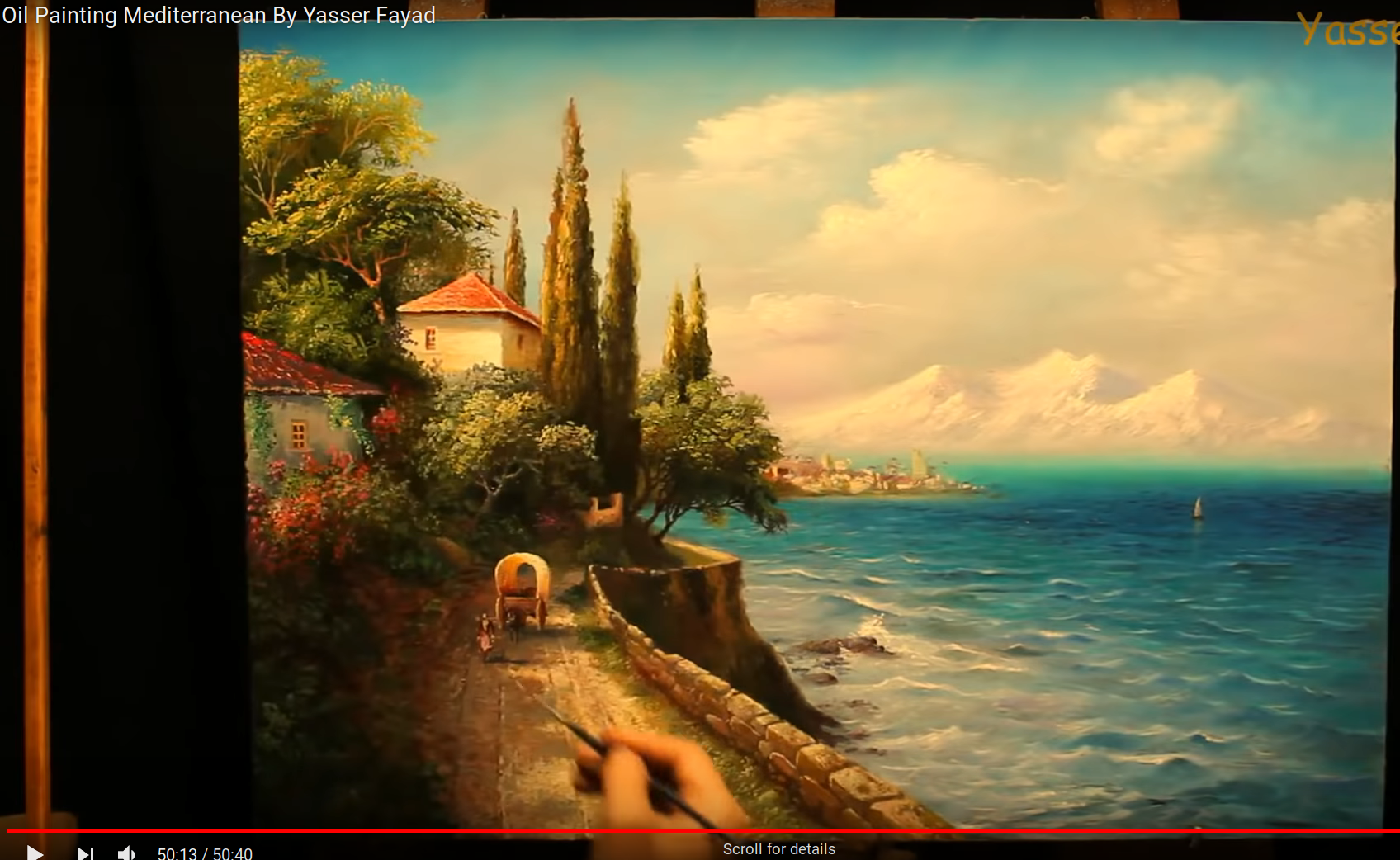
And he finishes as follows.
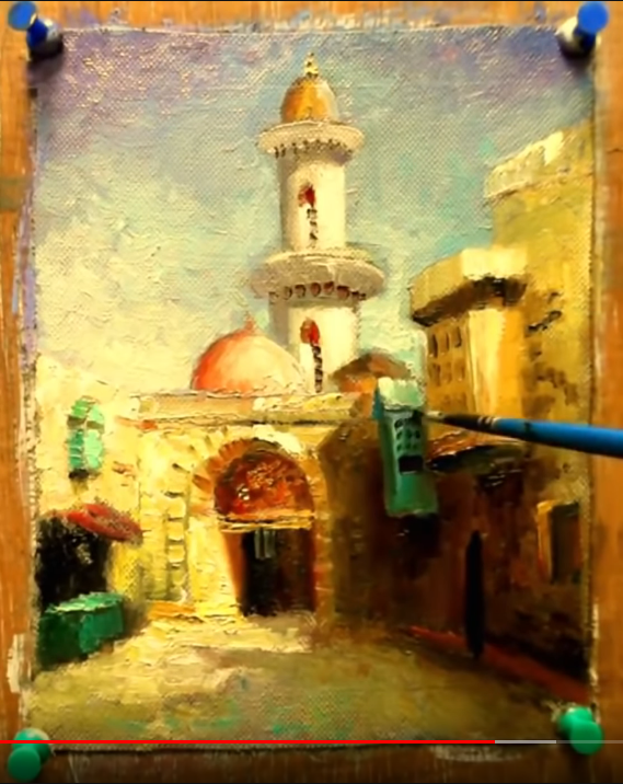
He does another small one of Cairo.
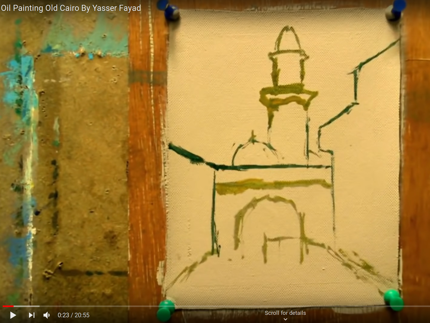
Goes here like this for all the brightly lit areas…
And then this for the start of the shadows…
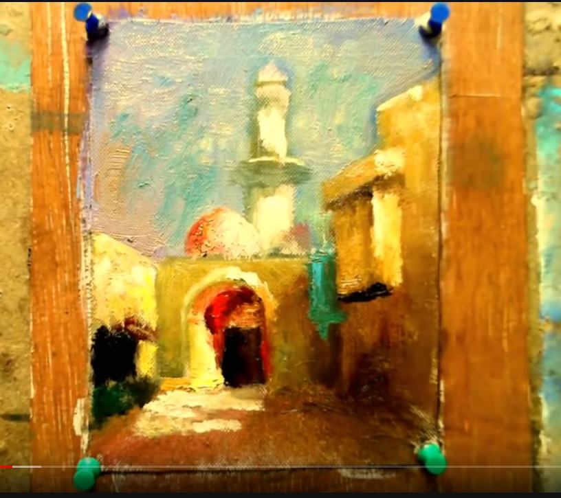
The edits many of the surfaces to be lighter mostly via thicker paint. Again, not a style I paint in but I respect that this version of “painterly” “brush-strokey” work is what the medium was most suited to for so many years.
It’s good to keep in mind this limit of sorts, as once one gets into less brush strokes showing, and more intensity by way of glazes, you are entering a world where physics of light, chemistry of color, and spatial rendering end up better done in an electronic or photographic medium.
I skip forward to where he has also added more features, and then added light upon the whole scene via white.
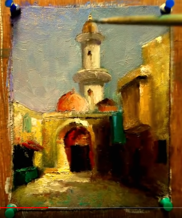
Then he’s onto adding the rest of the detailed features such as figures, and a tunes into a general sense of where the sunlight is coming from.
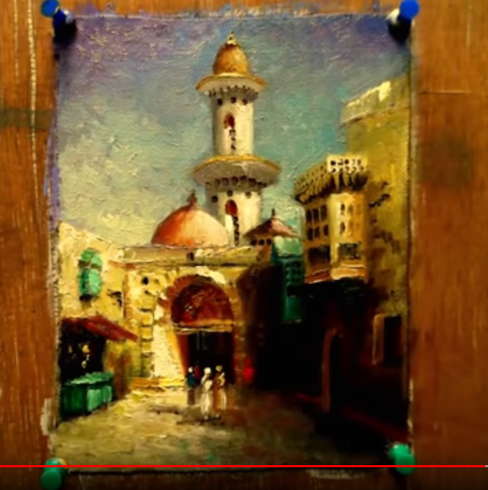
More figures, more details, more light correction… I will always like the depth and tone of oil for this reason, -even at this small scale the umber, reds, ochre, create a lot of foundation for the textile colors / inks such as are in the clothing and green building features. It would be hard to know without further checking what a realistic palette of such a scene would be, -but this isn’t realism. It’s definitely the next best thing.
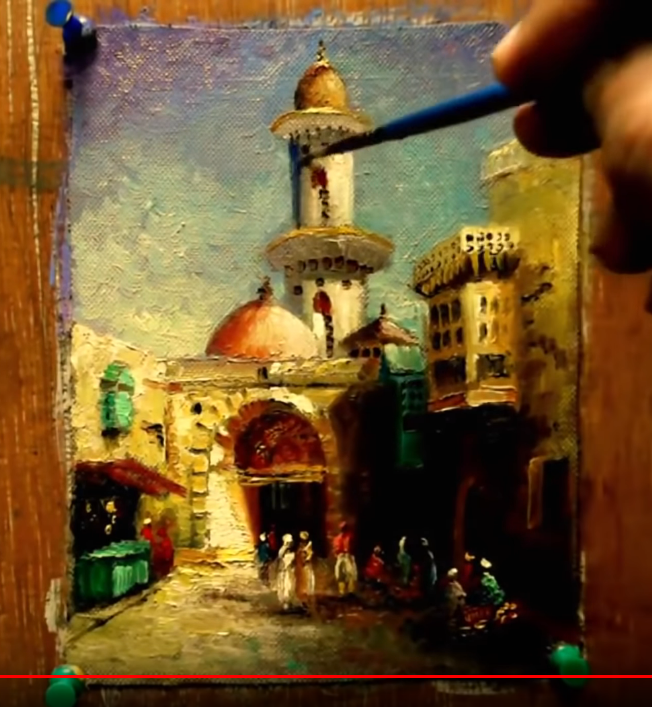
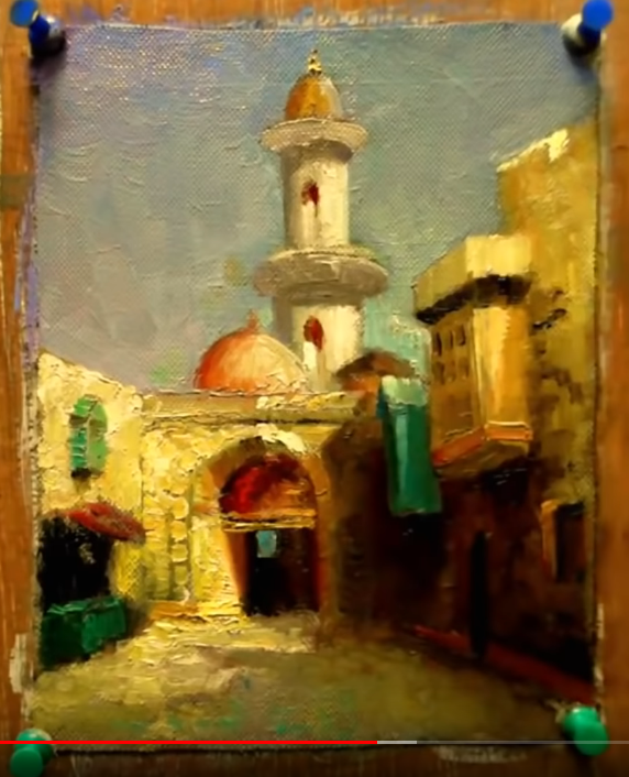
He finishes with a wave of light across the whole work and signs it.
This is a good example of light and shadow, earth tones, and something a bit less boring than landscapes.
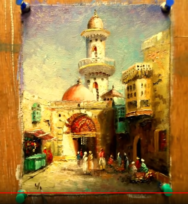
Many lessons can be learned on the basics of rendering a “tall” “portrait” with all 3 dimensional aspects touched upon.
a

b
c
d
e
f
g
h
